Split Bunny
Flat money, settled without the argument.
Flatmates in Indian PGs pay for rent, electricity and milk separately, and nobody keeps one record. This app shows who has to pay whom, explains every amount, and lets you pay by UPI. Built in three days. I directed the product and the design, and built it with AI.
- Role
- Product owner and design director
- Platform
- Android · Flutter
- Built with
- AI
Discovery on 6 October. A real user testing version 2 on 8 October.
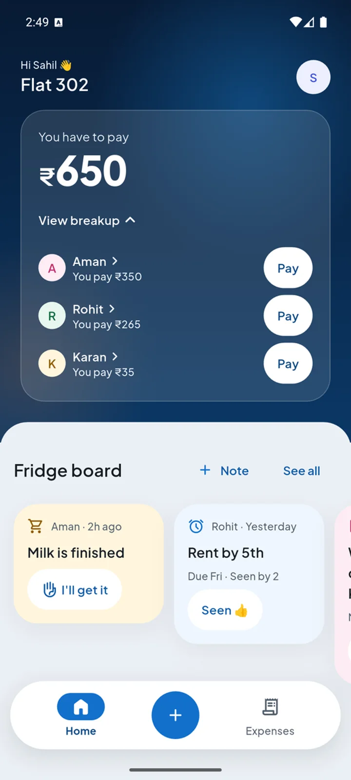
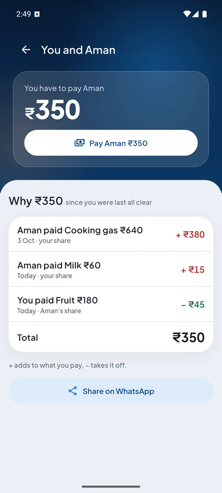
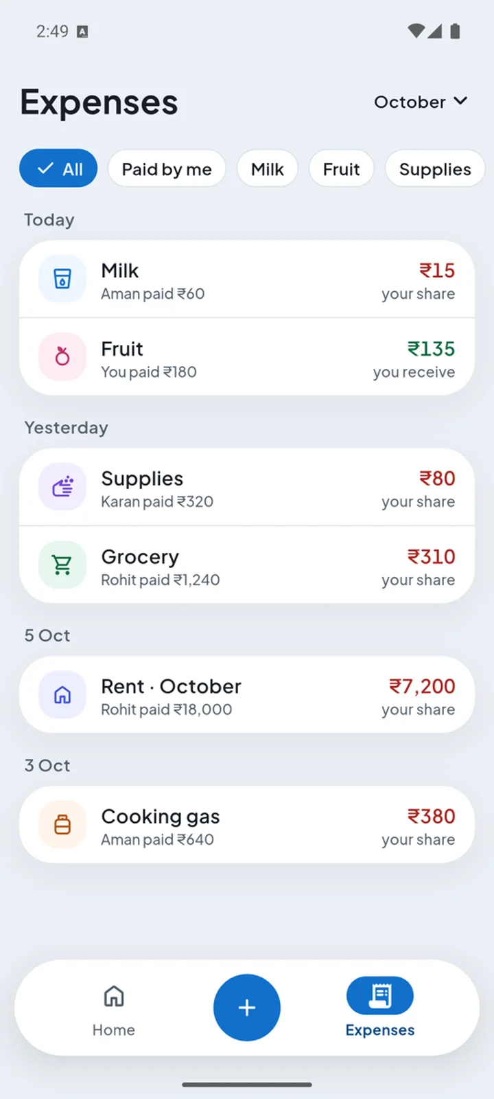
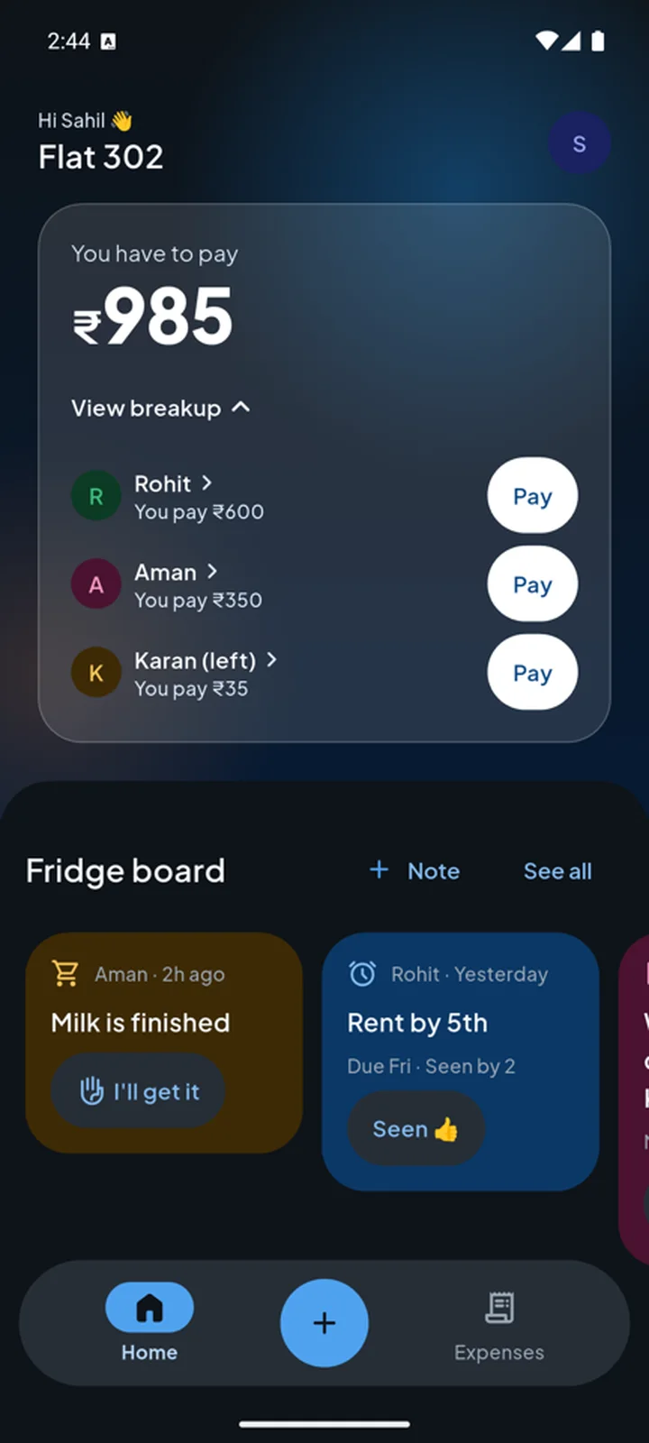
Tap any amount to see exactly where it came from.
A balance only changes when the other person taps Received.
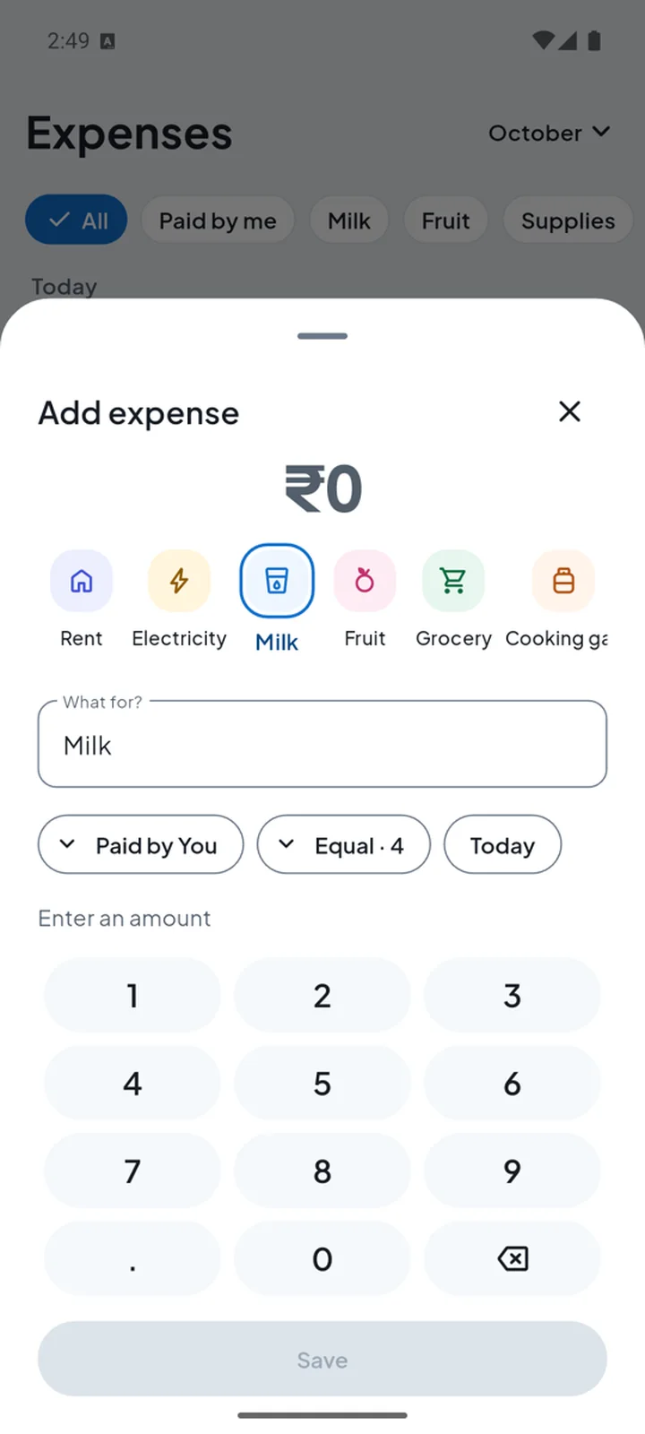
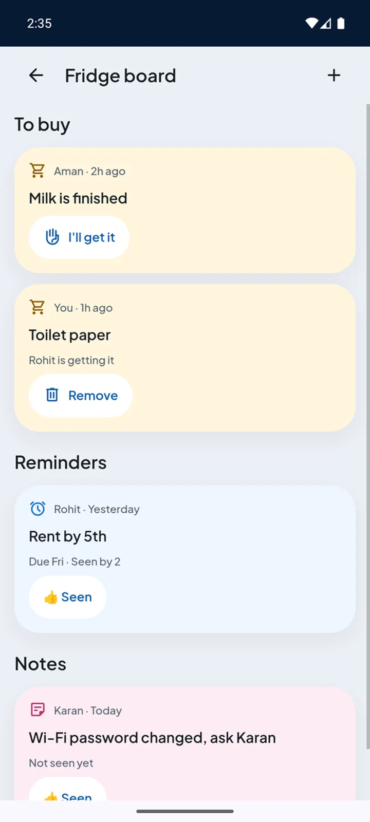
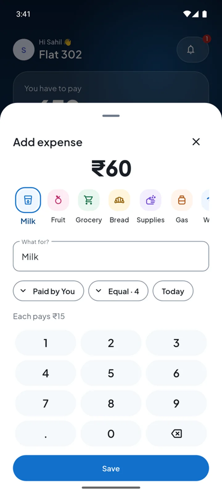
“Milk is finished” becomes an expense in one tap.
Three days, problem to a tested app.
Each day ended with something a person could use.
- 6 Oct Day 1
Problem and system
- The problem and the name
- Research and a project memory
- Design tokens, flows and wireframes
- 7 Oct Day 2
Screens, rejected twice
- All screens, a mascot, a clickable prototype
- Not happy, twice: two new looks
- Plain words, the Fridge board, the Flutter app
- 8 Oct Day 3
A real user, then version 2
- The first real-user test
- A new structure, built into the app
- An audit, and every issue fixed
What three days made.
How it was made, step by step.
Flatmates pay separately. Nobody keeps one record.
Rent, electricity, milk, fruit: different people pay for different things. Nobody keeps one record, so money talk gets awkward and splits feel unfair.
The job the app has to do: tell me, without arguing, who has to pay whom, and how much.
Can't beat the big app on features. So pick the niche.
I looked at seven apps. Free, UPI and India-first are already taken. The open space: the monthly-money app for Indian flats and PGs.
The one who pays, the one who organises, and everyone else.
Not everyone will install it. The app has to work around them.
Nudges belong on WhatsApp, not buried in another app.
What I chose, and why.
The receiver confirms every payment.
UPI opens your own UPI app, and a balance only changes when the other person taps Received. No one can fake a payment.
Plain words only.
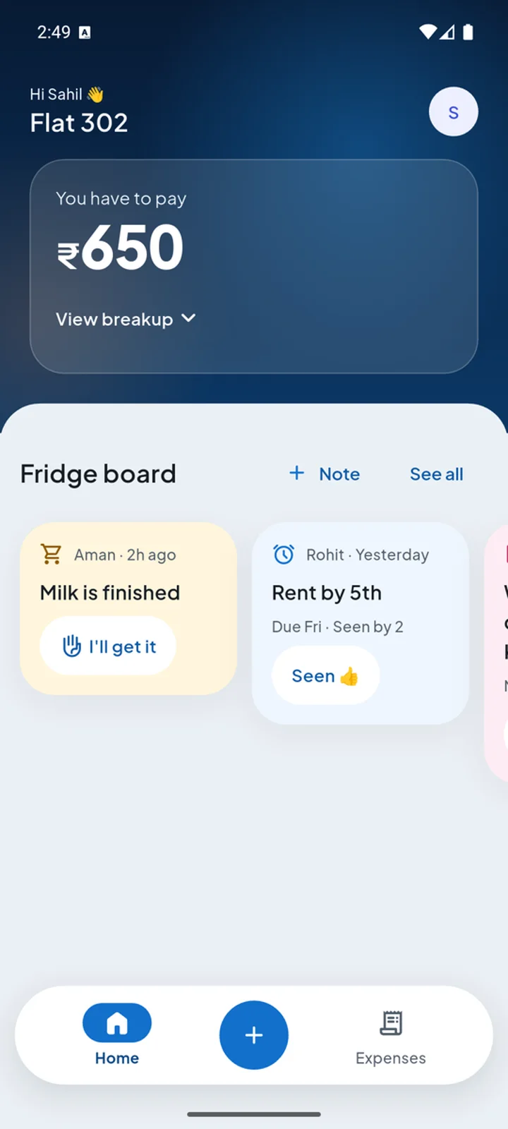
“You have to pay” instead of “You owe”. Everyday users didn't understand the jargon, so it became a hard rule.
A Fridge board.
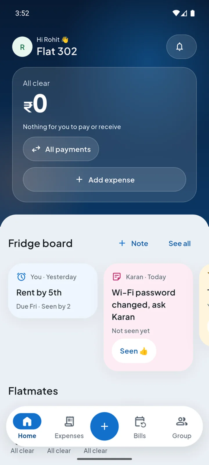
Sticky notes like “Milk is finished”. Tap Bought and the expense is already filled in. A reason to open the app every day.
One set of design tokens.
The same tokens make the website and the app. Two full redesigns took under an hour, and the money tests kept passing.
Rejected twice. Then a real user changed the structure.
Over three days: research, flows, tokens, wireframes, all screens, a clickable prototype, then the Flutter app. I wasn't happy with the look twice, and asked for it again each time.
It passed every check. Then it failed its first real user.
A flatmate from a four-person PG tried it. Adding an expense was easy. After exploring, he said: “Kuch samajh nahi aa raha” (I don't understand anything).
The problem wasn't the colours. One expense showed up in up to six places. So version 2 changed the structure.
Bills merged into Expenses. Nothing repeats.
Home shows one total, with “View breakup” if you want more.
Every amount explains itself, line by line, ready to share on WhatsApp.
Checks for the maths. People for the meaning.
Automated checks ran on every change, an audit agent reviewed each milestone, and the app was tested with real taps on an installed build.
A balance formula error, found before any money was shown.
Found only by tapping the installed app, not in screenshots.
Payment IDs would have been copied to cloud backup. Switched off.
A tested app. Next: real flats.
Data on the phone, 39 of 39 app tests passing.
So every flatmate sees the same numbers.
A month of real use before anything else.
The AI checked the maths. Only a person could tell me it didn't make sense.
What I'd carry into the next one.
Structure beats style
The first user's confusion came from repetition, not colours.
Tokens make change cheap
Two redesigns in under an hour, with every test still passing.
Tap the real app
Installed-app testing found bugs that screenshots never showed.
 The person behind this work
Finance first, then design. I build what I design.
Read my story →
Next project
Subscription page →
All work
The person behind this work
Finance first, then design. I build what I design.
Read my story →
Next project
Subscription page →
All work