Billing Bunny
Bill · Stock · Staff, for a small shop's busy counter.
Garment shops count stock by design, colour and size, bill at a crowded counter and trust staff with money. This Android app is built for exactly that, in English, Hindi and Marathi. From brief to a Play-ready app in two days. I led the product and the design, and built it with AI.
- Role
- Product owner and designer
- Platform
- Android
- Languages
- English · हिंदी · मराठी
Research on 16 October. A signed build ready for Google Play on 17 October.
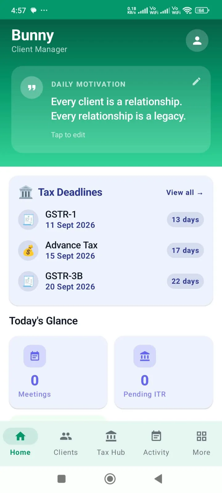
A bill made without internet uploads by itself when the connection is back.
Above a limit, the owner's PIN is needed. Nothing is ever deleted.
One font family for all three scripts, so the app stays light.
Two days, brief to Play-ready.
Every step ended with something I could open and test.
- 16 Oct 12:30
Brief and research
- 7 searches, 6 competitors, 8 gaps
- My own shop's flow, in my words
- The name and the business model
- 16 Oct 14:44
Plan in grey
- An app map and 8 key flows
- 27 grey wireframes before any colour
- 16 Oct 15:03
Look and feel
- 3 visual directions compared
- My brand colour, one font for 3 scripts
- 16 Oct 15:42
Mockup rejected
- A polished mockup hid real problems
- New rule: run every flow on an emulator
- 16 Oct 16:12
9 flows, one by one
- Each flow tested, then approved by me
- About 51 issues caught on the way
- 16 Oct 21:12
The real app
- 5 builders working in parallel
- Offline billing tested end to end
- First signed build
- 17 Oct Morning
On my own phone
- My feedback, release after release
- Backup and restore added
- 17 Oct 15:05
Ready for Google Play
- Store kit, crash reports, a new icon
What two days made.
How it was made, step by step.
A garment shop counts stock by design, colour and size.
The owner needs to know what's in stock, bill quickly when the counter is busy, and let staff work without losing control of money or stock.
The apps shops use today fall short in the same places.
Every staff member gets the same powers, whether the owner trusts them or not.
Billing takes too many taps while customers wait.
Billing stops without internet, and staff create the same item twice.
Desk research first, then my own shop's flow.
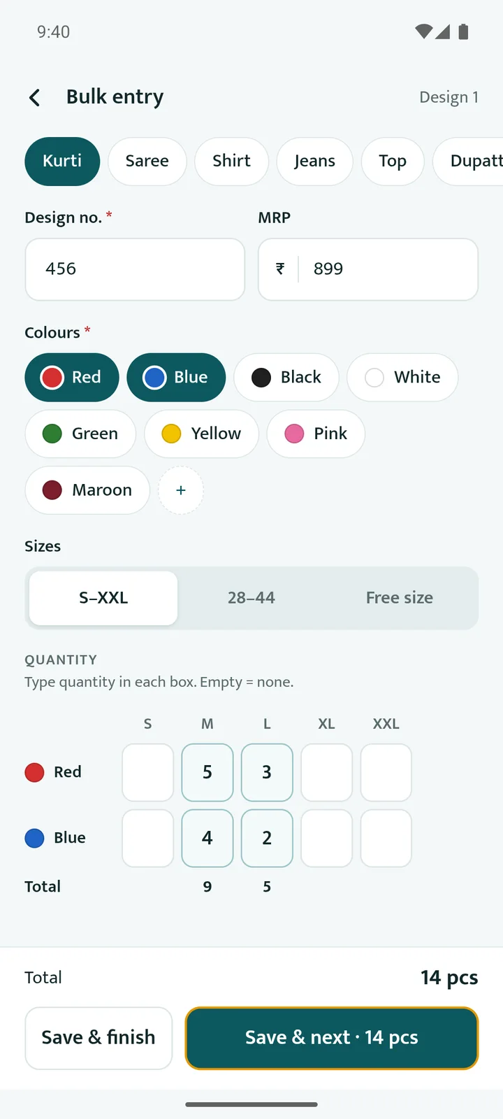
Seven searches and six competitors gave eight gaps. Then I described how my own shop really works, and one example became the heart of the app: a red kurti, size M, design 456.
One design, every colour and size, one barcode each.
Describe the real job, not a feature list. The kurti example shaped everything.
What I chose, and why.
Stock by design, colour and size.
That's how garment shops count. A bulk grid adds a whole design, every colour and size, in one screen.
Permissions per person, not fixed roles.
Each staff member gets their own limits. Above a limit, the owner's PIN is needed.
Nothing is ever deleted.
Bills are voided with a reason and staff are switched off, not removed. The record always stays complete.
My brand colour, one font for three scripts.
My own teal on a calm layout, and one font family for English, Hindi and Marathi, so the app stays light and consistent.
Two days, one flow at a time.
Every screen was planned in grey before any colour, and every flow was tested before I approved it.
A picture of a phone is not a phone.
I stopped the polished mockup and asked for every flow to be run on an Android emulator first. That caught about 51 issues before I saw each flow, then I tested on my own phone.
A bill made offline uploaded by itself seconds after the connection came back.
Automated tests check that one shop can never see another, and staff can't raise their own limits.
A restore put back exactly the records that were deleted, and showed them first.
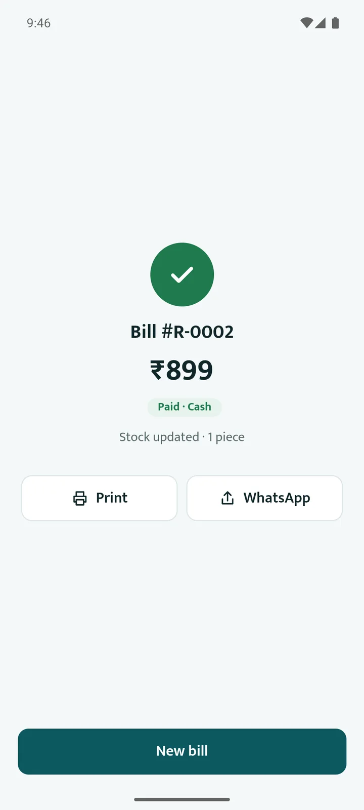
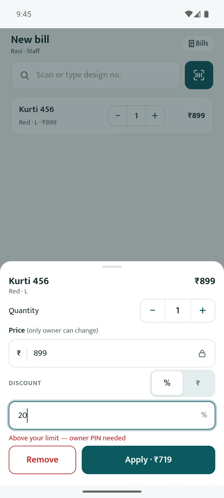
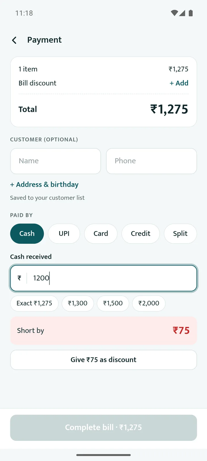
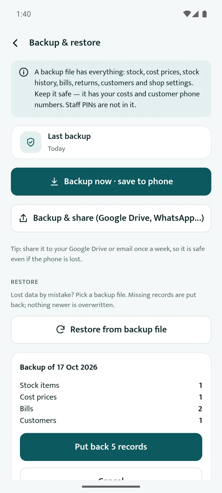
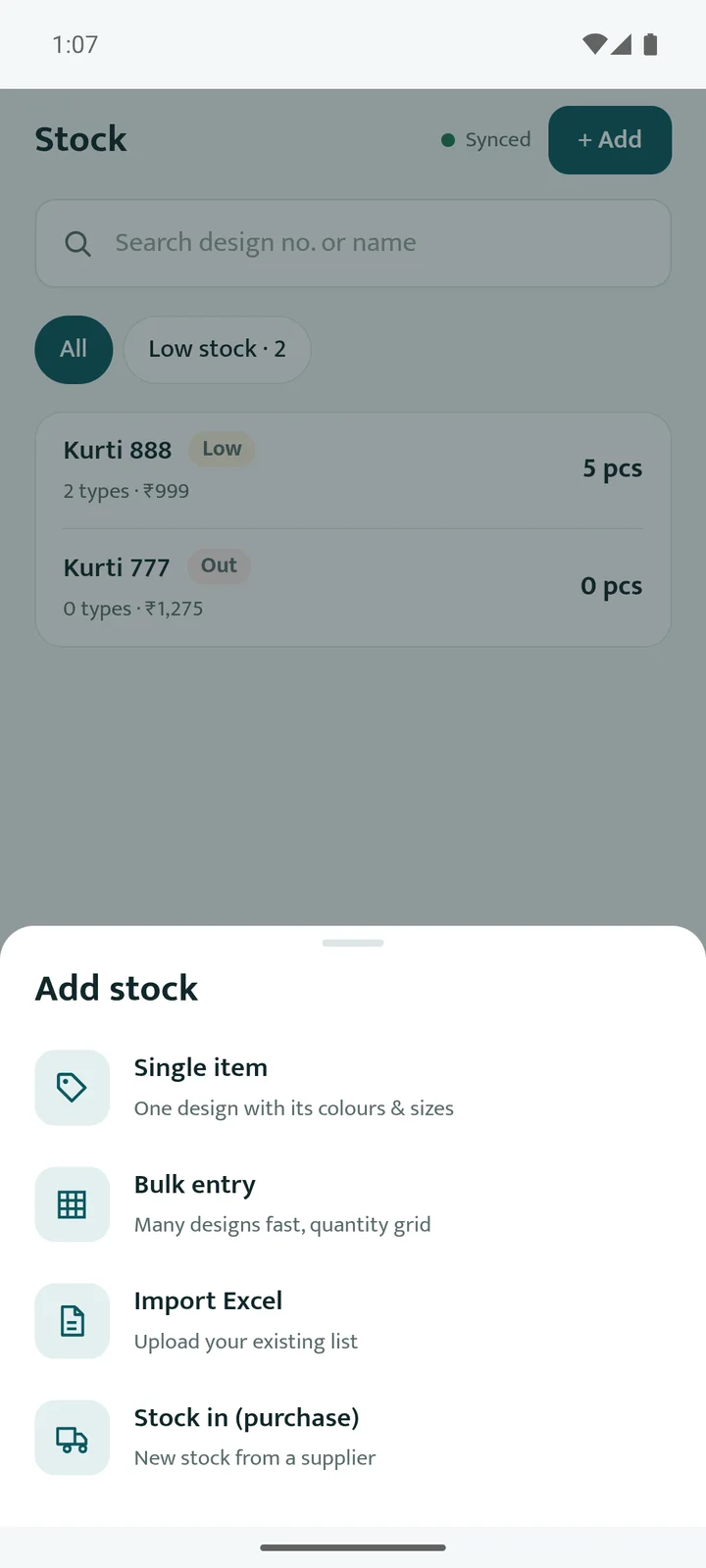
Built for the counter.
Big targets, few steps, and the owner always in control.
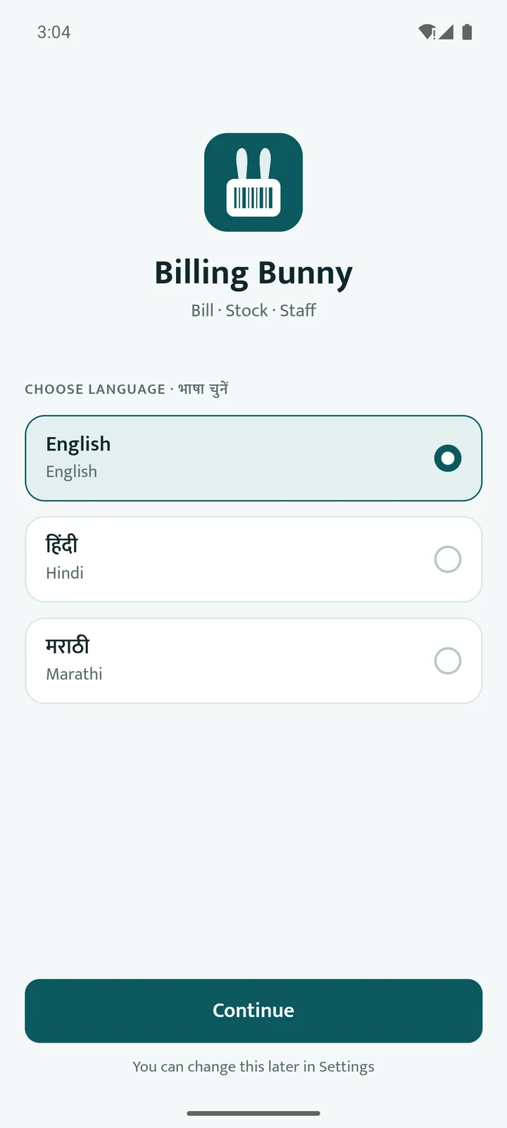
Ready for Google Play. Next: real shops.
Three languages, offline billing, backup and restore, crash reports.
One or two shops for a week, before anything else.
Internal testing first, then the public listing.
What I'd carry into the next one.
A picture of a phone is not a phone
Testing on a running app caught about 51 issues the mockup hid.
Describe the real job
One real example, a red kurti in size M, gave the product its core model.
Ask “what about…?”
Asking about backup exposed a real gap. Now there's backup and restore.