Investing on your own rules.
A strategy builder for everyday investors. Set your rules, test them on 10 years of data, then take the strategy live. It checks the rules for you and suggests what to buy and sell.
Try the working prototype ↗BeFM live ↗
- Role
- Product Designer
- Company
- MarketsMojo
- Platform
- Web and mobile
- Status
- Live
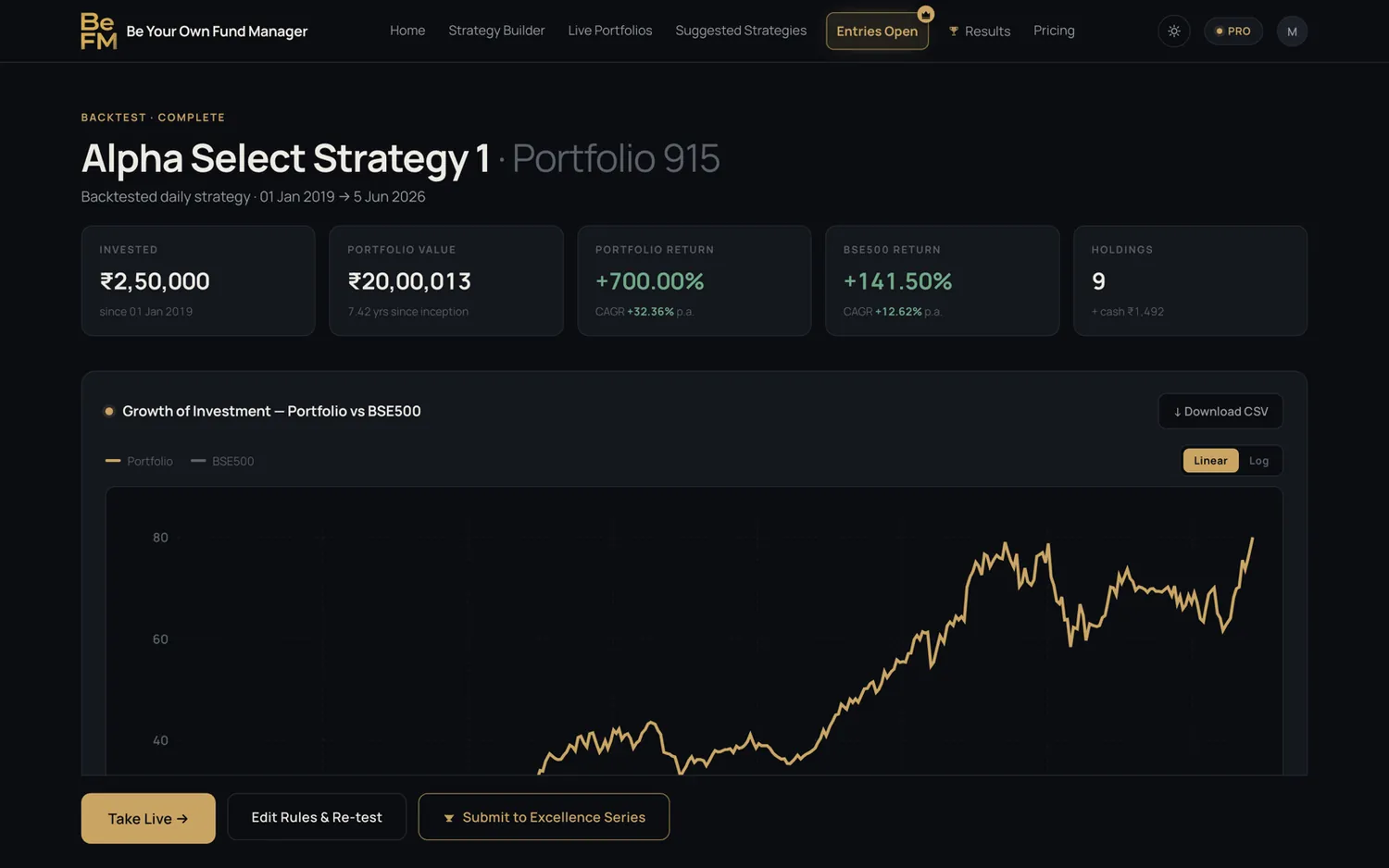

Stock screeners on the market let users find stocks only by writing queries. But building a complete investment strategy is more difficult.
Users need to decide which stocks to buy, when to buy, when to sell, how often to check the rules and whether the strategy actually works.
BeFM was designed to make this process easier, without requiring users to know query writing.
Three investors. One product.
Each one needs something different. The design had to work for all three.
Has a clear view. Needs a way to act on it.
Wants proof before putting money in.
Wants full control. Leaves if simple means weaker.
What I chose, and why.
Don't copy the screeners.
The obvious idea was a simpler query language, like the tools already on the market. I pushed for something else: let people start from what they want. Rules are picked from ready-made filters, with a guide on screen, so nobody writes a query.
Ask about the goal before showing options.
I sketched five ideas. Four showed every option first. The one that worked asks what the portfolio is for, then shows only what fits.
Show “and” and “or” as a picture.
People use these words without thinking about logic. So rules are joined visually and read like a sentence.
Watch people fail, then fix it.
One task: build a strategy you would put money in. Every pause changed the design. The Entry step alone took three rounds.
Five steps to build. Test before you decide.
A new product, shaped by a lot of trial and error. First the flow, then the screens.
Each step answers one question from the problem. Building, testing and going live are kept separate.
Sketches, then three rounds of testing on the Entry step.
Five directions, on paper
Construction, entry rules, filters and charts, sketched five different ways and shown to the team.
Learned: Four of them showed every option first. They all failed the same way.
Map every screen
A working wireframe of the whole product, every screen in order, so real people could click through it.
Learned: Where people hesitated showed what to fix. Most of it was on the Entry step.
Four ways to place the rules
Four layouts for showing the rules you've picked, each one built inside the real Entry screen.
Learned: Seeing all four in place made the choice clear.
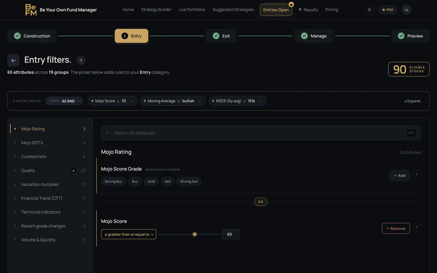
Every part has a job.
 12345
12345- 1A clear pathFive steps. You always know where you are.
- 2Rules you can readEach rule is a short chip.
- 3Live countChanges the moment you add a rule.
- 4Small groups65 filters, never shown all at once.
- 5“Or”, drawnShown between rules, not explained.
One look across every screen, and a real phone version.
It sold before it was built.
The working prototype was shown live to real users before any engineering started. It generated revenue within the first hour, and that funded the build.
Website and mobile, captured from the working prototype. Click any screen to see it full size.
WebsiteAI wrote the code. I made every decision.
What I'd carry into the next one.
Tidy isn't solved
A neat screen can hide a problem that's still there.
Building changes the design
Empty states and the way back only got answered once it was real.