Sixteen prices. Now two simple questions.
A new page for buying MarketsMojo's research plans.
- Role
- Product Designer
- Company
- MarketsMojo
- Platform
- Web and mobile
- Status
- Live
More plans to sell. Less room to explain.
The old page sold one plan length, as three separate cards. The new one had to carry four markets and four lengths, and still be easier to use.
Three kinds of visitor.
Each one needs the page to do something different.
Needs a fast way to pay.
Needs to compare, fairly.
The last chance to make an offer.
What I chose, and why.
Ask one question at a time.
Each question has only four answers, so there are only four prices on screen.
Show the monthly price.
So a 6-month plan and a 3-year plan can be compared fairly.
Keep the full table, one tap away.
All sixteen prices sit behind a Compare button. Tap any price to choose it.
No fake countdown.
A timer that restarts on reload isn't a deadline. So there isn't one.
Three tries before the version that shipped.
Four cards, all shouting
Four plan cards side by side, with a countdown clock above them.
Learned: A clock that restarts on every reload isn't a deadline. It was dropped.
The wrong question
Plans grouped by product bundle, for a single one-year term.
Learned: It asked people to pick a bundle. They think in markets first.
Works all year
The sale styling removed, the same market tabs and plan rows, plus a five-year option.
Learned: The layout didn't need the sale to work.
Two questions, then pay.
And when someone tries to leave, a calm offer slides up.
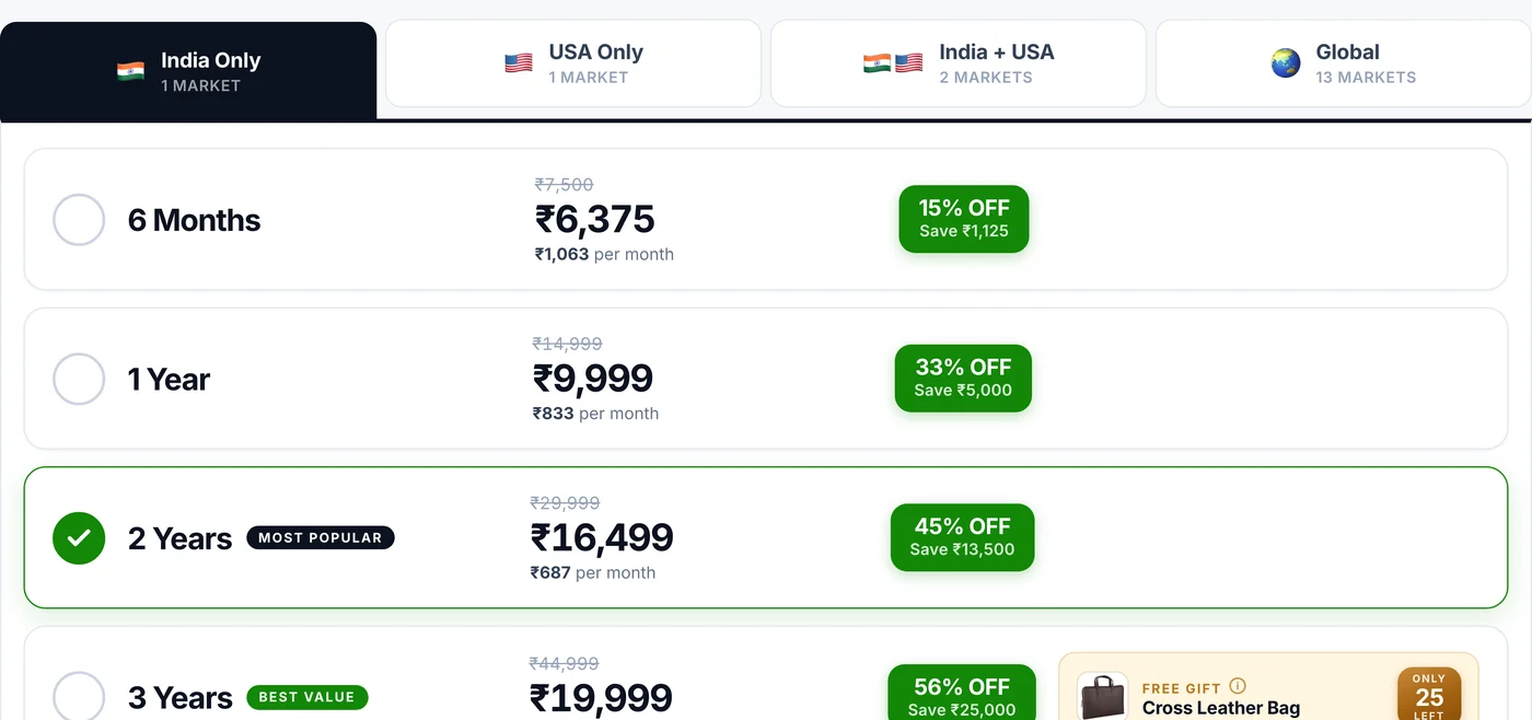 12345
12345- 1MarketFour tabs.
- 2LengthFour rows.
- 3Fair compareEvery price also shown per month.
- 4The savingAs a percentage and in rupees.
- 5A suggestionOne plan is marked as the popular pick.
Four ways of leaving. One calm sheet. The offer depends on who you are.
Everything on one table when you ask for it. On a phone, the pay bar stays put.
It shipped, and it's still running.
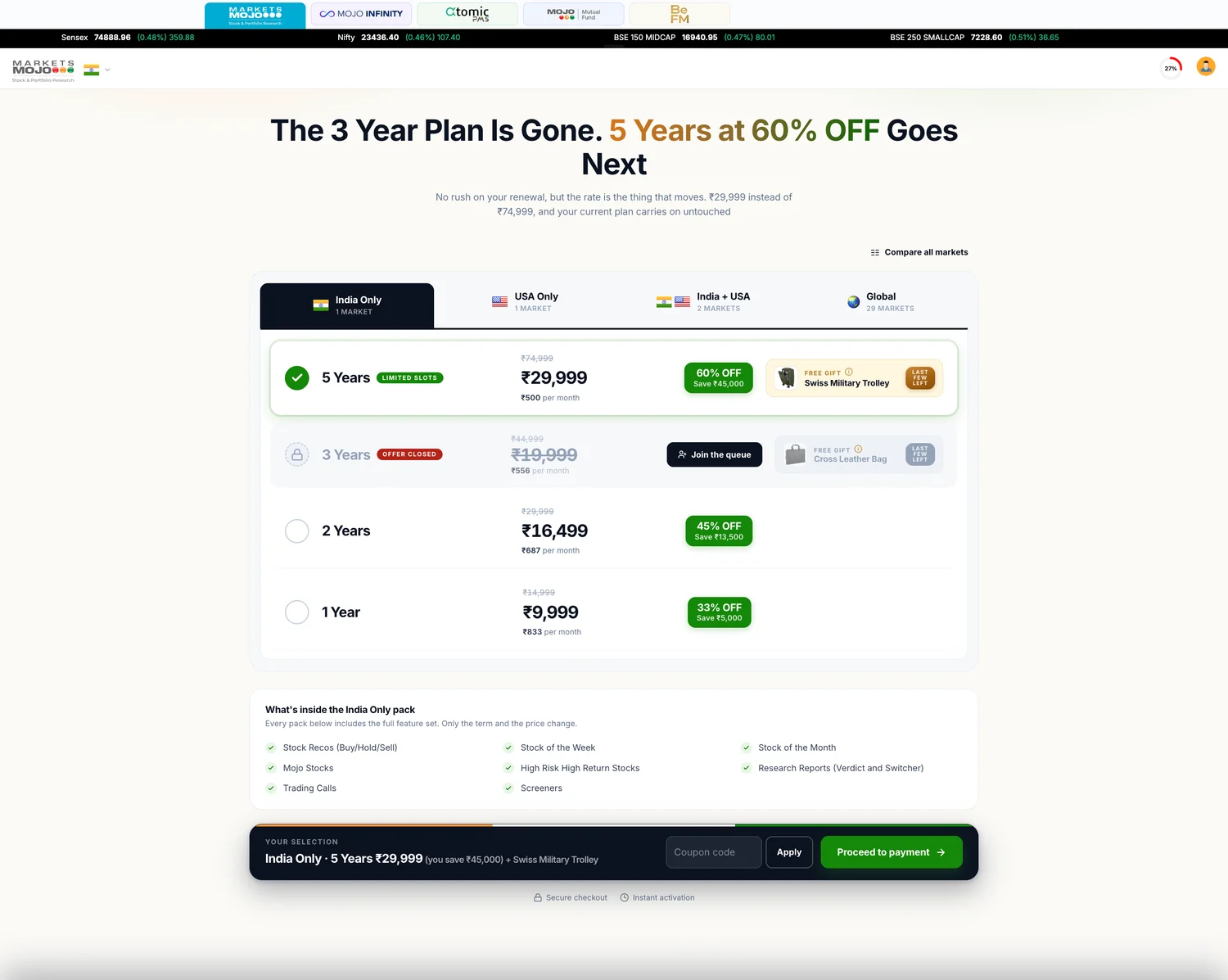
The rows were flipped, so the best monthly price is read first.
A closed plan shows a Join the queue button instead of Buy.
Global grew from 13 to 29 markets. The page didn't change shape.
A page built for one sale became how the product is sold.
What I'd carry into the next one.
Split the decision
Two small questions beat one big table.
Hide, don't delete
The full table stayed, just out of the main path.
Hand over something working
Developers learned the behaviour by using it.