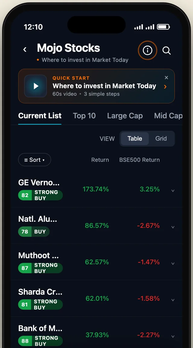
A quick-help entry for the Mojo Stocks list in the MarketsMojo app: a 60-second video and three steps, placed so new users find it and regular users aren't bothered.
ProblemNew users needed help. Regular users didn't want to see it.
MadeThree working options, so the team could compare them instead of arguing.
ResultOption A shipped: a small strip you can close, and an info icon that stays.
The full story
The brief, and the tension in it
New users couldn't tell what the stock list was for. The team wanted help to be prominent. But it also had to stay out of the way for people who already know the app. Those two asks pull in opposite directions, so I built all three answers instead of arguing about them.
Three options, compared
A · ShippedA strip and an iconA one-line quick-start strip above the list that you can close, plus an info icon in the header that stays. It costs two rows of the list, once.
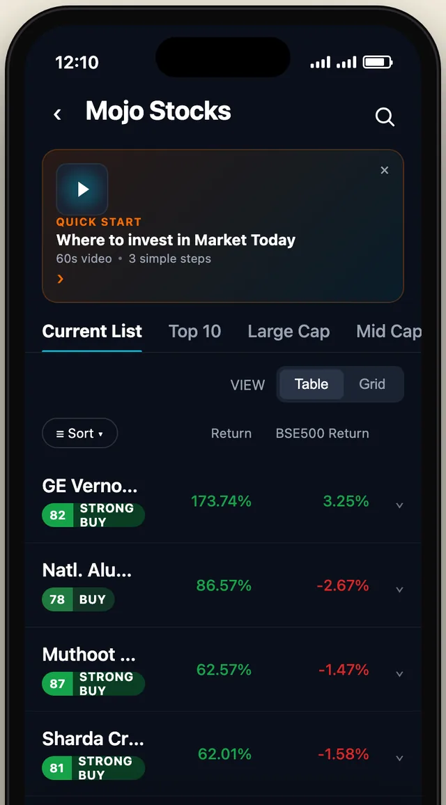
B · RejectedA big tip cardA full card with a video above the list. It pushes the list down the screen, and in a stock app the list is the product.
C · RejectedA welcome screenA full-screen takeover on first open. Sure to be seen, and sure to be skipped. It blocks the app before it has earned any attention.
Why A won
It was the only option that split the two jobs. The strip is prominent once and can be closed. The info icon keeps help reachable for ever, without taking space from the list again. B and C made help prominent by taking something from the user: screen space or their first ten seconds.
HTML prototype3 working optionsiPhone frameLive in the app

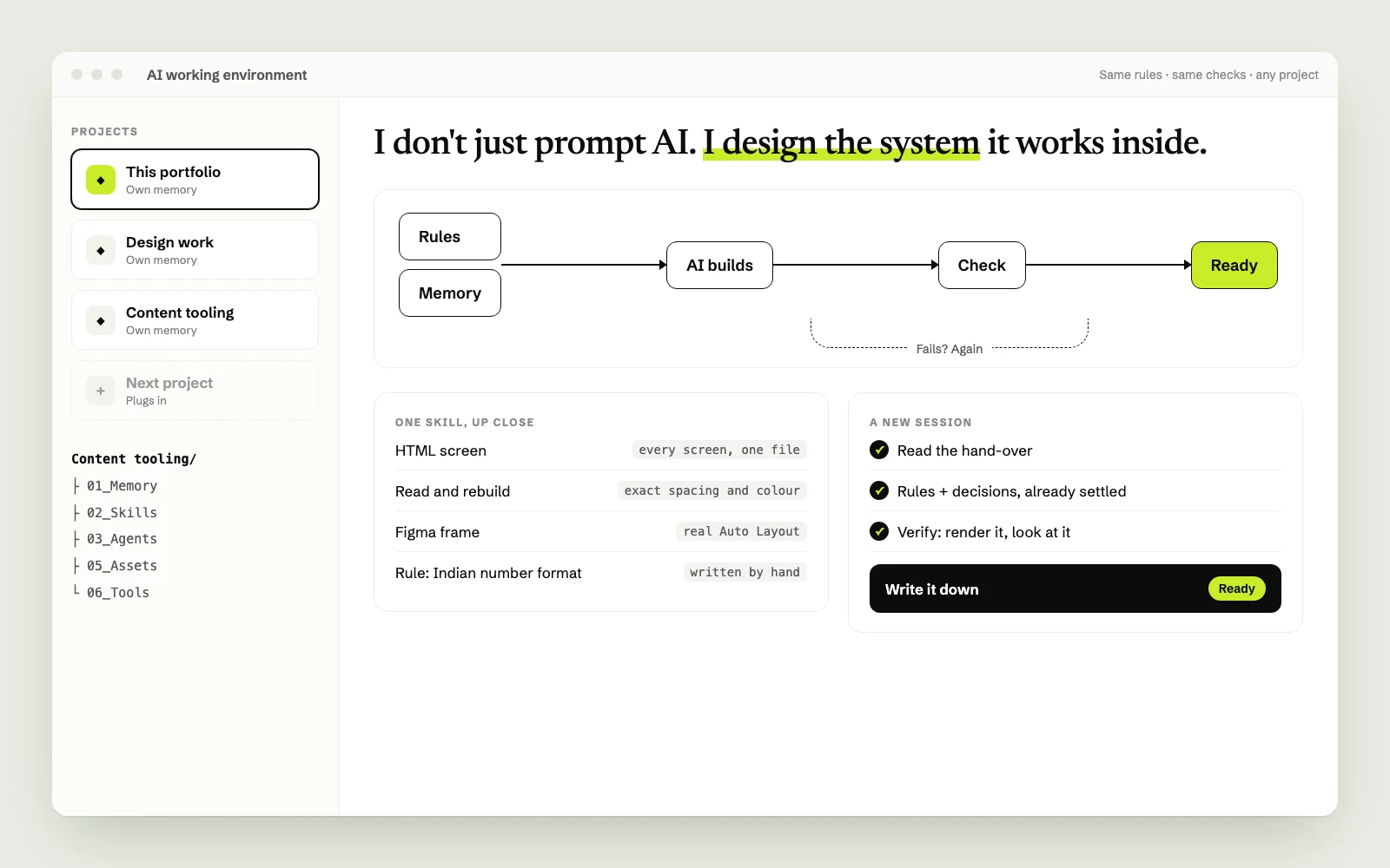 Case study · System design · AII don't just prompt AI. I design the system it works inside.A system I designed that lets AI work consistently, on any project.How I use AI →