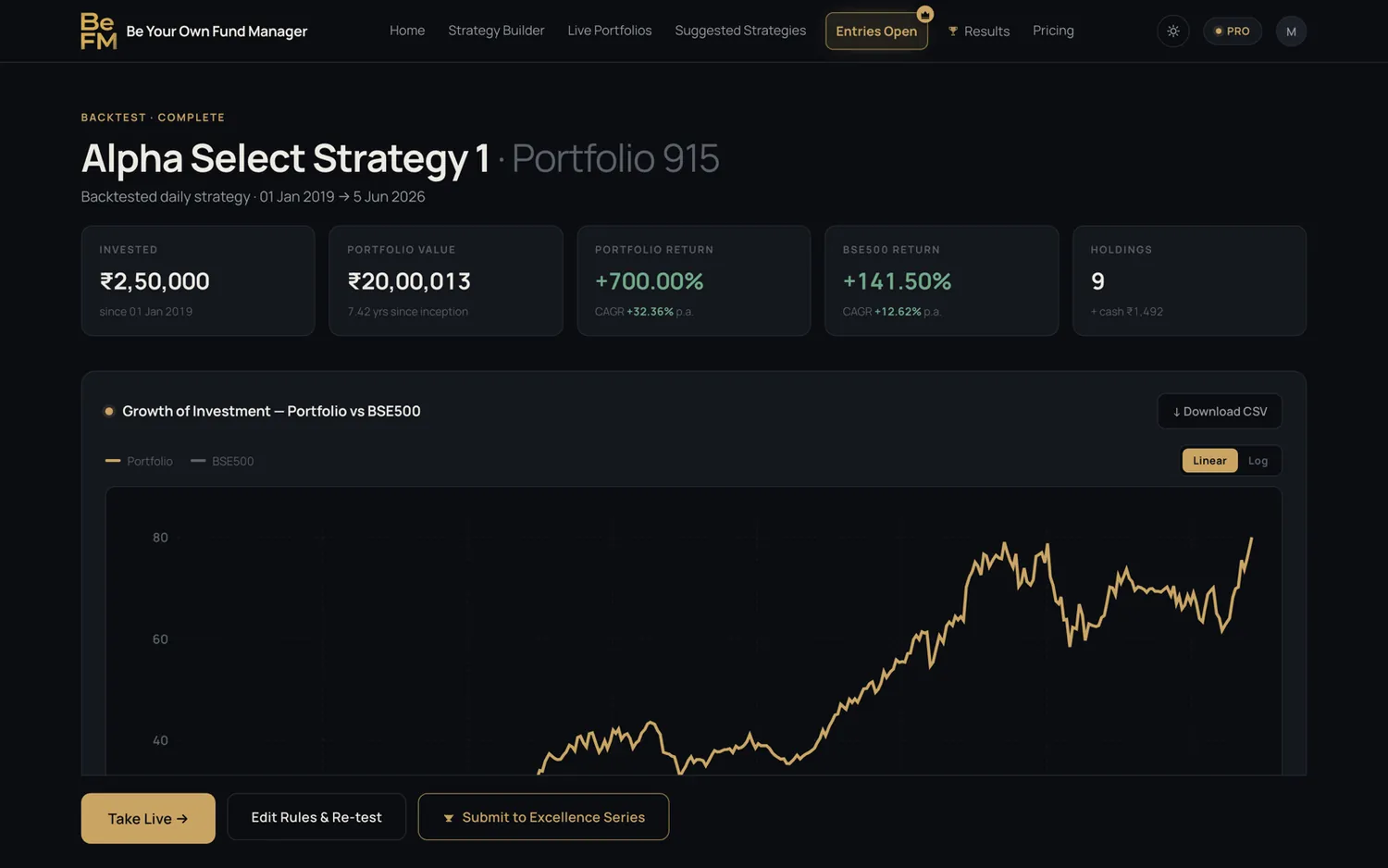
Designed by me. Shipped by me.
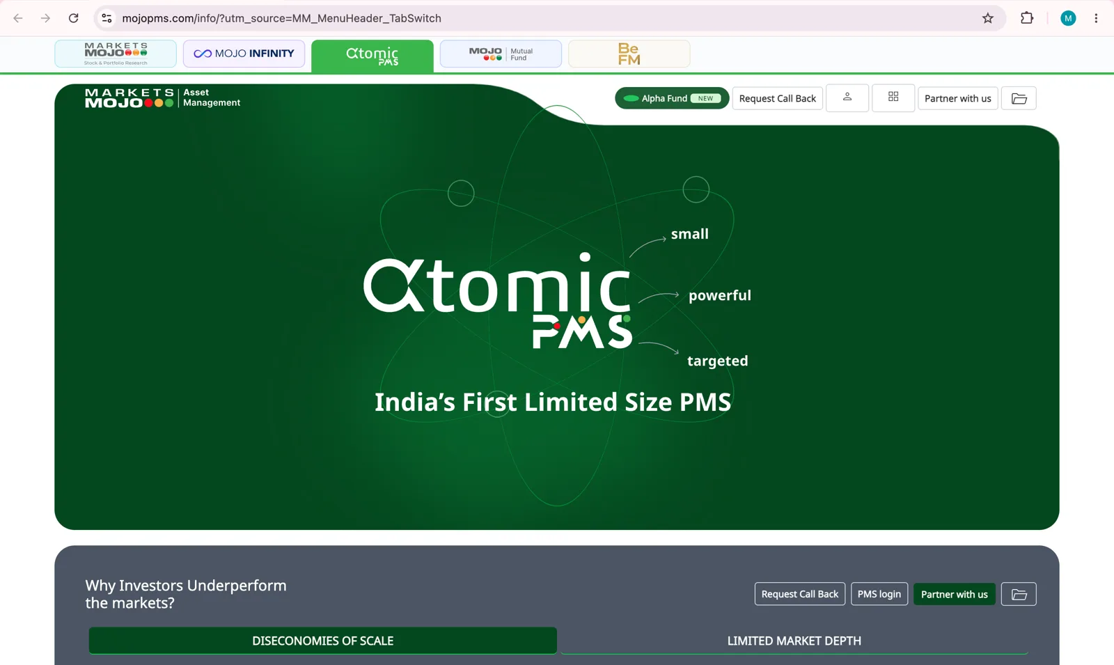
One bar that links MarketsMojo's five products. I designed it like a folder divider, built it into four different websites and took it live myself.
- Role
- Design and development
- Company
- MarketsMojo
- Released through
- Bitbucket, sandbox, prepod
- Status
- Live on 4 sites
Five products lived on five separate websites.
MarketsMojo, Mojo Infinity, Atomic PMS, Mojo Mutual Fund and BeFM each had their own site. A customer on one had no easy way to find the others.
A folder divider, not a button.
Marketplace apps switch between their stores with buttons. I wanted something that feels like finance: a file with divider tabs.
The line under the bar takes the colour of the active tab and joins it, so the tab reads as the top of the page you're on.
The active tab and the line under it share one colour, so the tab reads as the top of this page.
Click a tab. It also changes on its own until you do.
Three rounds, from a hidden menu to one bar.
Tabs and a menu row
Two early ideas: product tabs above the header, and a row of wealth platforms inside the menu.
Learned: Tucked inside a menu, the other products were still easy to miss.
Three patterns, side by side
A top strip, a grid launcher and a left rail, each built into a full copy of the homepage so the team could compare them live.
Learned: The top strip won: always visible, and closest to the mobile app.
One bar per product
Five versions, one for each site. The active tab and its line take the product's own colour, and there's space for a banner.
Learned: The brand colours were agreed with the team before hand-off.
Then I took it live myself.
Four websites, built three different ways. The same bar went into each one, through the same release path.
The same for every site, checked on the real page at the end.
Real problems I hit while taking it live, and how I fixed each one.
- 01Fixed
The bar was there, but invisible
On the PMS dashboard the site's own pinned header sat on top of it. I fixed the stacking order and moved the header below the bar.
- 02Fixed
Everything pinned below it moved
A new bar on top shifted the header, side menu, side panel and mobile menu. Each was moved by the bar's exact height, not by guesswork.
- 03Fixed
A gap opened on scroll
When the bar hid, the header moved up but the menu didn't. I split one number into two: the space the bar takes, and where the header sits.
- 04Fixed
Three copies of the same bar
One site runs two Angular apps and PHP pages. I compared each copy against the tested version before every release.
- 05Fixed
Pushed is not live
A push only sends code. I proved each release by searching the live page for my own code, not by trusting the branch.
On the real websites, desktop and phone.
On a phone the bar turns into five brand tiles, with the same joined line under the active one.
People now explore every product.
Before, each product was an island. With the bar on every site, customers began moving between the Mojo products.
The design and the release were both mine: from the first sketch to the live page.
I don't stop at the design file. I take it live.
What I'd carry into the next one.
Borrow from the real world
The folder tab came from finance files, not from other apps.
Move one thing, check everything pinned to it
A new bar on top shifted every fixed header and menu below it.
Pushed isn't live
Prove a change on the live page itself, not on the branch.