Five brands. Five posts a day. One design queue.
The social team did not need a designer for every post. They needed the layout decisions already made. So I built the template engine that holds them.
Pick a product. Type four fields. Take the image and the copy. The design work happens once, inside the template. Not once a day, per post, per brand.
The problem was never one post. It was the next thirty-five.
Five product brands, each owed a post a day. Every one of them queued behind the same designer, and every one of them also needed its own copy for four platforms.
Doing it by hand did not just cost time. By the third week the same template had drifted — type sizes off, logo redrawn, the disclaimer in a different place. Consistency was the thing quietly leaking.
In a regulated business, the constraint comes before the layout.
Markets Mojo is SEBI registered. That decides what a post may say long before it decides how a post may look — so the rule had to live inside the tool, not in a document nobody reopens.
No stock names
Organic social carries aggregates only — how many, which sectors. The named call sits behind the paid product.
No call language
No buy, sell, target price or guaranteed return. The writer supplies one insight line that explains a number already on the card.
Always disclosed
Every creative carries the educational-content line and the as-of date. It is drawn by the template, so it cannot be forgotten.
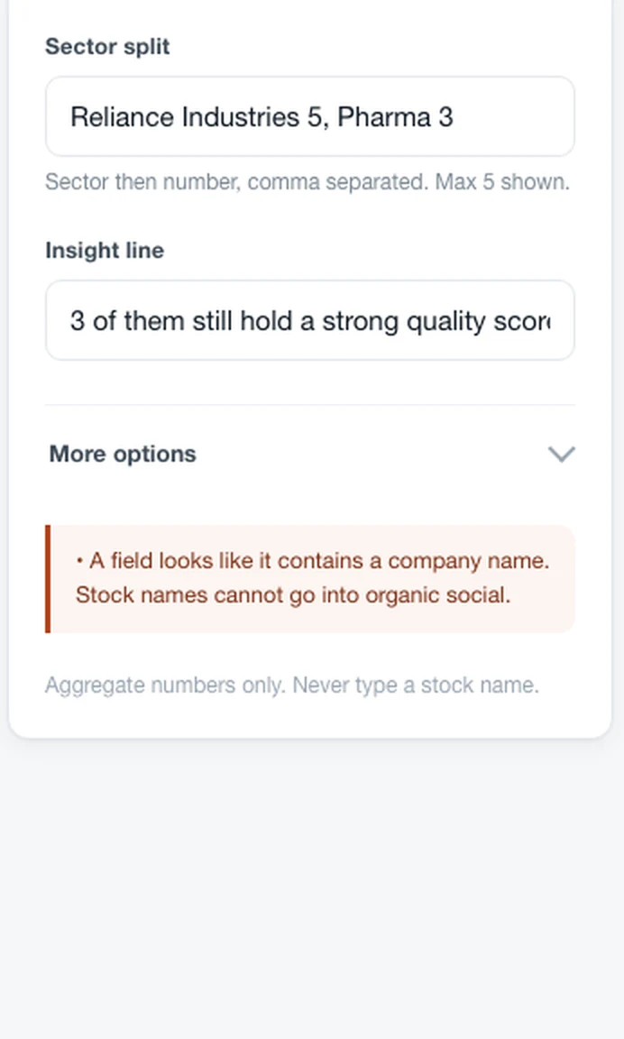
There is no submit step to fail at. The warning appears while the field is still being typed.
Company suffixes — Ltd, Pvt, Industries, Corp — flag the field. The writer is not asked to self-certify.
Compliance sits at the bottom of the panel in small type. Present, not preachy. The loud element is the warning, and only when it applies.
Published market data may name stocks. Recommendations may not. That distinction is recorded in the project's decision log so it cannot be relitigated every week.
A rule that lives in a PDF gets broken on a busy day. A rule that lives in the input box cannot be.
The design principle the whole tool rests onEveryone asks for the portal first. The portal is the wrapper.
The obvious ask was a hosted CMS with logins and a calendar. But none of that makes a post. What makes a post is the template that already knows the brand, the size, the disclaimer and the rule. So I built that first, as a single file the team can open offline.
Template engine
One HTML file. Type the numbers, get the creative and the copy. No install, no login, no server.
API fetch
The daily numbers arrive on their own instead of being typed off a screenshot.
Auto register
Every export writes its own row to the content register, with its post ID.
Hosted portal
Accounts, calendar, approvals. Worth building only once the engine is proven.
Sequencing it this way meant the team got something usable on day one rather than a login screen in month three. Each later phase replaces one manual step and leaves the engine untouched.
The brand is not a style. It is five values the template reads.
Colour, typeface, logo, default CTA, hashtag set. Once a brand is data, the same post can be rendered five ways without anyone opening a design file.
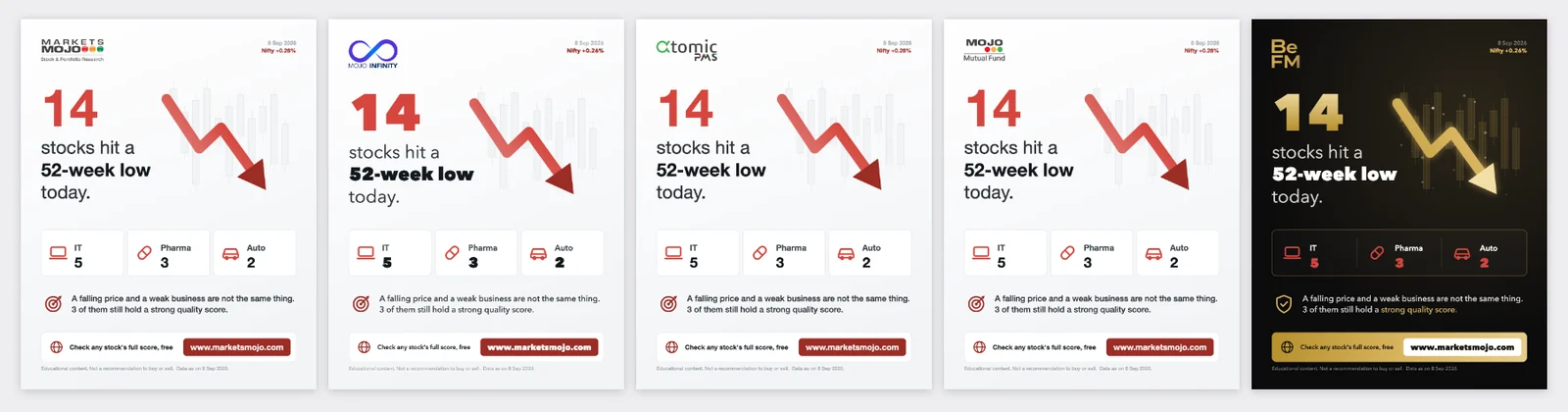

This is the part that removes the queue. Before, a common announcement meant five separate design requests. Now it is one input and one download.
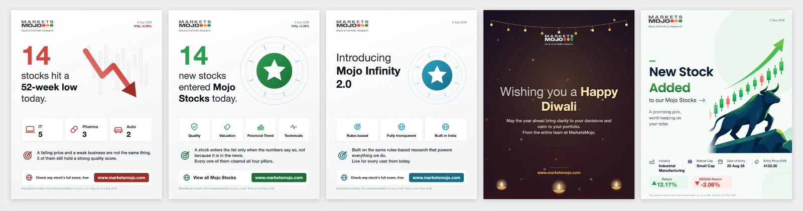
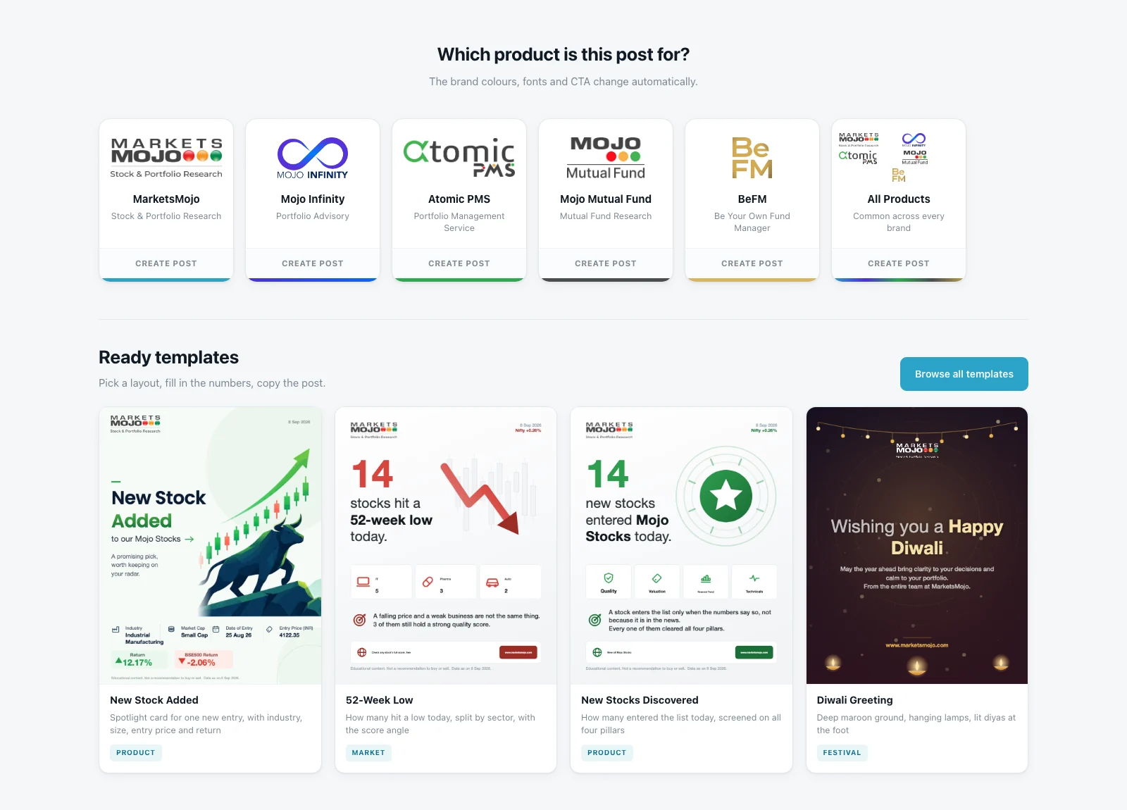
26 ready templates, in four families.
A blank canvas is the slowest thing you can hand a writer. So the tool opens on layouts that are already finished, sorted by the kind of story being told.
Market
Something the market did today. Driven by a count and a sector split.
Product
Something the product found. The story is the screen that was passed, not a price move.
Brand
Launches, milestones, events. No count, no index reading — a written line and a badge.
Festival
Its own layout entirely: decorative ground, centred greeting, no CTA bar.
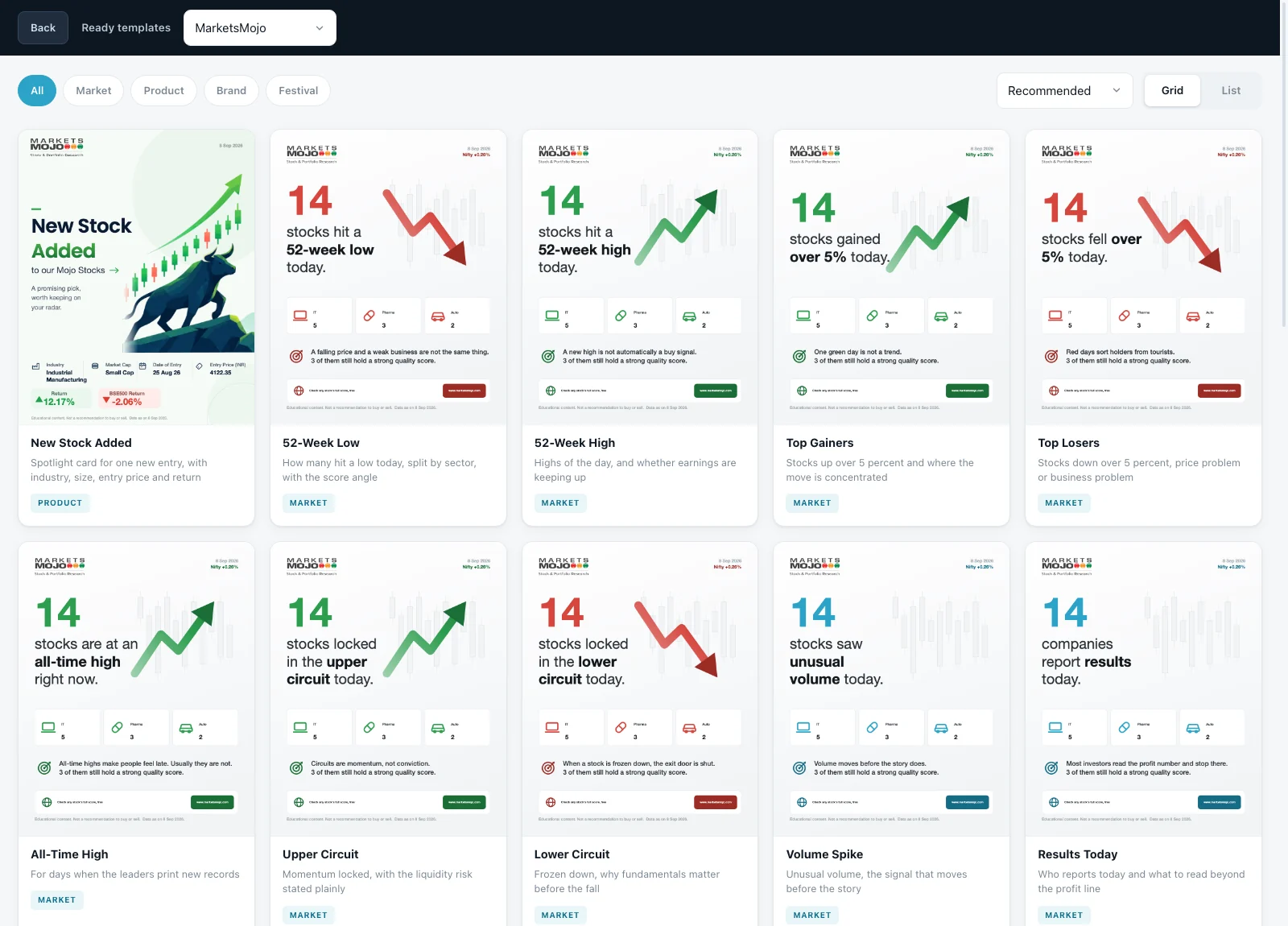
Thumbnails are the real thing
Each gallery card draws the actual template on a canvas at load. Nothing can go stale, because there is no separate preview image to update when a layout changes.
A sixth option: all products
Posts common to every brand get their own centred poster layout — a strip of five logos and a five-colour rule, rather than one brand borrowing the house voice.
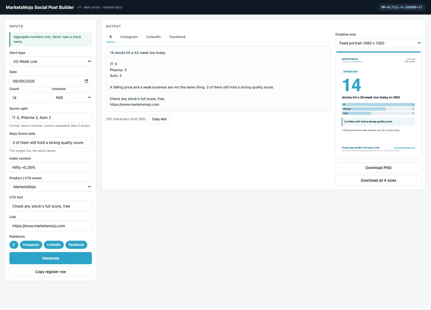
Three columns. What you type, what it looks like, what you paste.
The first version had tabs, twelve fields and a Generate button. Watching it get used made all three look wrong.
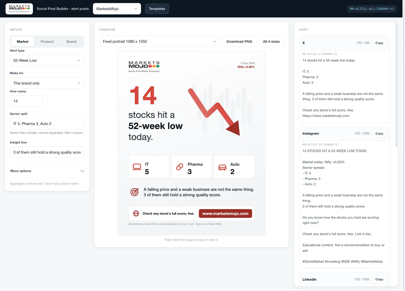
Alert type, how many, sector split, insight line. Everything else — CTA, link, accent, theme, platforms — sits behind More options. The panel stopped looking like a form and started looking like a decision.
Output updates live. A button that only redraws what the screen could have redrawn itself is a button that asks the user to do the computer's job.
The clipboard API is blocked when a file runs locally. Feeding the canvas into an img gives the writer the browser's own right-click Copy image, which always works.
X against 280, Instagram against 2200, LinkedIn against 3000. The limit is shown where the text is, so nobody pastes and finds out later.
MM-ALT52L-ALL-260908-V1 — product, alert, platform, date, version. It is visible on screen and copies into the content register with one click.
Controls were too small, there were too many fields, and too many things shouting to be pressed.
The feedback that produced the layout aboveThe visual pass that followed set the numbers the tool still uses: 15px base type, 42px controls, 12px cards, 9px on inputs. Small enough to fit a dense screen, large enough to hit on a laptop trackpad all day.
One layout that survives four canvases and two grounds.
A feed post, a square, a wide feature and a full-height story are not crops of each other. The template redistributes rather than rescales.
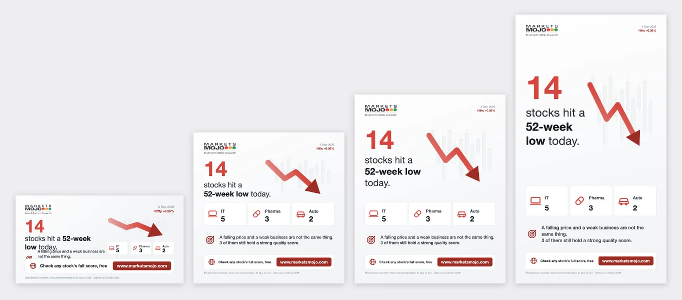
The wide 1200×630 is the one that still fights back. It has the least vertical room, so a long insight line crowds the headline — visible above. It is the next thing on the list, and it is on the list because the tool is honest enough to show it rather than crop it out.
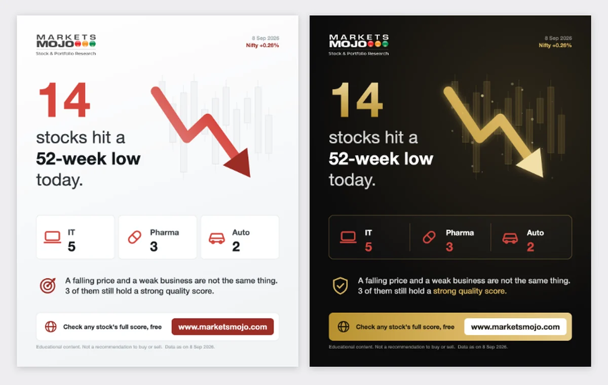
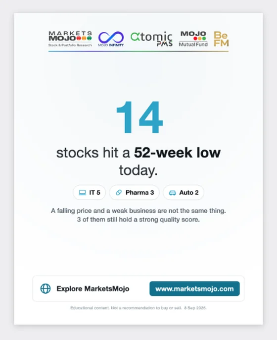
Colour follows direction
Green for highs, gains and upper circuits. Red for lows and losses. Brand colour for anything neutral — and switchable when a post must stay brand-locked.
The type is embedded
Fonts travel inside the file as base64. A creative built on one machine renders identically on another, instead of falling back silently to the wrong face.
Logos start from the master
Each mark is drawn from its full-resolution original and fitted without stretching, so nothing is ever displayed larger than it was supplied.
That last one came from a real failure. A creative looked soft and the first instinct was resolution — the actual cause was a 176px logo displayed at 170px, with nothing in reserve for a retina screen. Now every logo is checked against its display size.
Sixteen versions. Thirteen of them in one afternoon.
Each one went back in front of the person who would use it. Almost every jump below is a piece of feedback, not a feature I thought of.
16 builds · every one of them opened in front of the person who would use it
A form with a thumbnail became a real canvas renderer. Everything after this is refinement of a system that already worked.
Three columns instead of tabs. Four fields instead of twelve. Live output instead of a button. Bigger controls. Second and third template families.
The gallery of 26 ready templates, the all-products house layout, festival grounds, and batch rendering across five brands.
The lesson I keep from this build: the fastest way to lock a layout is to stop redesigning it. Take the approved creative, keep its CSS verbatim, template only the body, then diff the rebuild against the original to prove nothing moved.
One file. No install, no login, no server.
It runs from a folder on the team's own machines and works offline. That was the point — the tool had to survive the day it was needed most, not the day IT had time.
What is running
The sibling tool for the daily Market Wrap is in use, and its output was diffed against the approved creatives until it matched them exactly. The alert builder is handed over and waiting on its first live-data run — until that happens, I am not going to claim a time saving I have not measured.
What I would build next
The wrap tool blocks the download until every check passes; the post builder only warns. That escalation belongs here too. After that, phase two — the daily numbers arriving by API instead of being typed off a screenshot.
A data file the team edits by hand is not automation. It just moves the error. Validation belongs at the point of entry.
What building the first version taught me