← Portfolio
Shipped

Small things, built because someone needed them.

Not portfolio pieces. Each one exists because a real team had a problem on a Tuesday, and the fix was faster to build than to buy. Short entries — the problem, the options, and what shipped.

2 entriesInternal toolsProduct decisionsAll in use
In use The internal PDF to Word converter
For the compliance team

PDF → Word converter

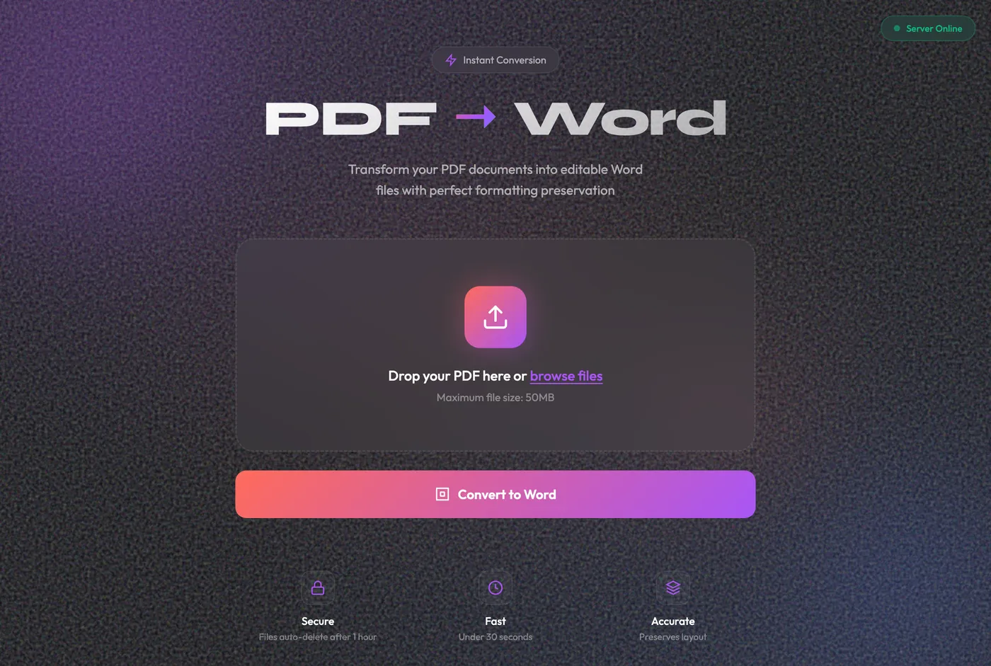
Why it exists Compliance needed to edit PDFs, and the only options were free conversion websites. Uploading regulated documents to an unknown third party was the actual problem — not the conversion.

So it runs on the machine, not the internet. Drag a PDF in, get an editable Word file out, and the file never leaves the building. Uploads delete themselves after an hour.

The design decision that mattered was not the interface — it was the double-click launcher. The users are compliance officers, not developers. A tool that needs a terminal command would never have been used twice.
Python · FlaskLocal onlyDrag & dropAuto-deleteOne-click launch
For the product team · Markets Mojo

A help layer that does not get in the way

New users could not tell what the stock list was for. The team wanted a quick-help entry point on the screen — a 60-second video and three steps.

The brief, and the tension in it Make it prominent — but it must not interrupt the flow or irritate anyone who already knows the app. Those two requirements pull in opposite directions, so I built all three answers rather than argue about them.
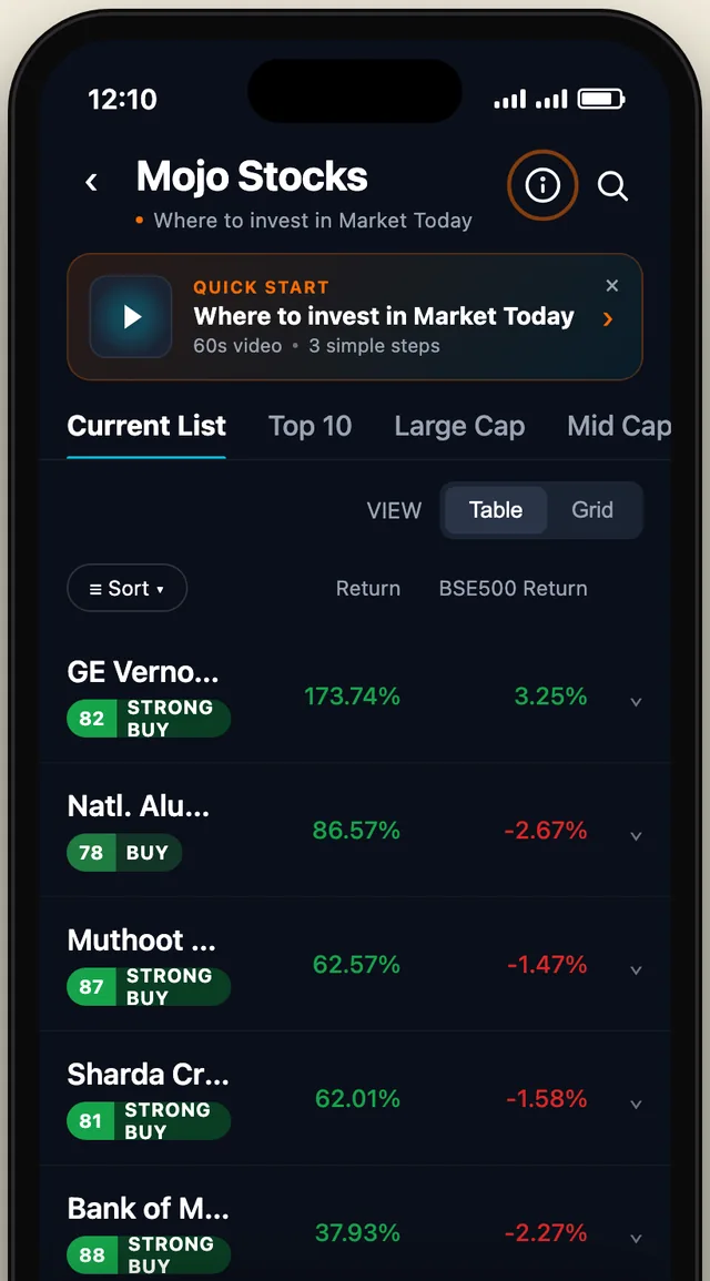
Option A — icon in the header plus a compact quick-start strip
A · Icon + stripShipped
Minimal

A one-line quick-start strip above the list, dismissible — and an ⓘ in the header that stays there for ever.

Costs two rows of the list, once. Help remains reachable after dismissal.
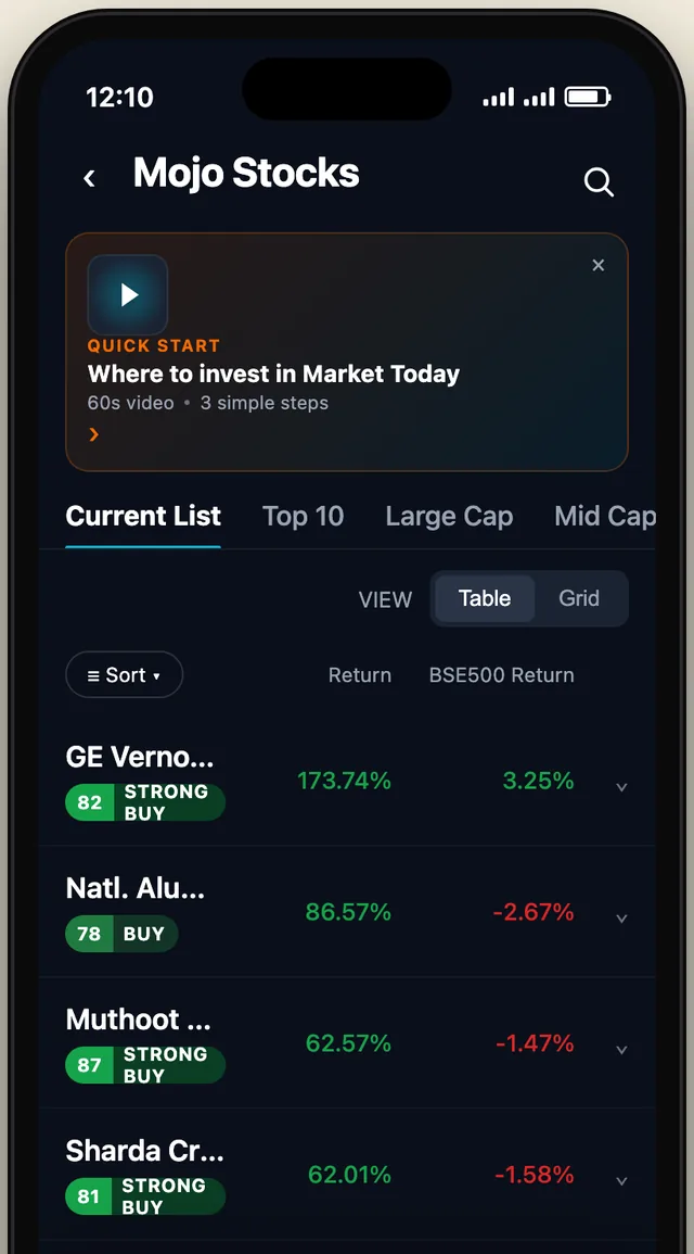
Option B — a large inline tip card
B · Inline cardRejected
Discoverable

A full tip card with a video thumbnail, sitting directly above the content.

Costs four rows and pushes the list below the fold — in a stock-picking app, the list is the product.
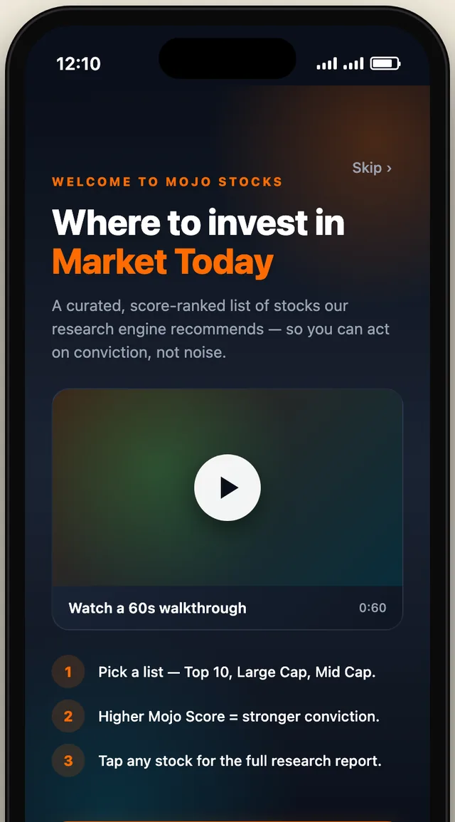
Option C — a full-screen welcome splash
C · Welcome splashRejected
First-visit

A full takeover on first open — video, three numbered steps, and a Skip link.

Guarantees it is seen, and guarantees it is skipped. Blocks the app before it has earned a second of attention.

Option A shipped, and is live in the app. It was the only one that separated the two jobs: the strip is prominent once and can be dismissed, while the ⓘ makes help permanently available without ever occupying content space again. B and C both answered “prominent” by taking something away from the user — vertical space, or their first ten seconds.

HTML prototype3 optionsiPhone 16 frameShipped: A