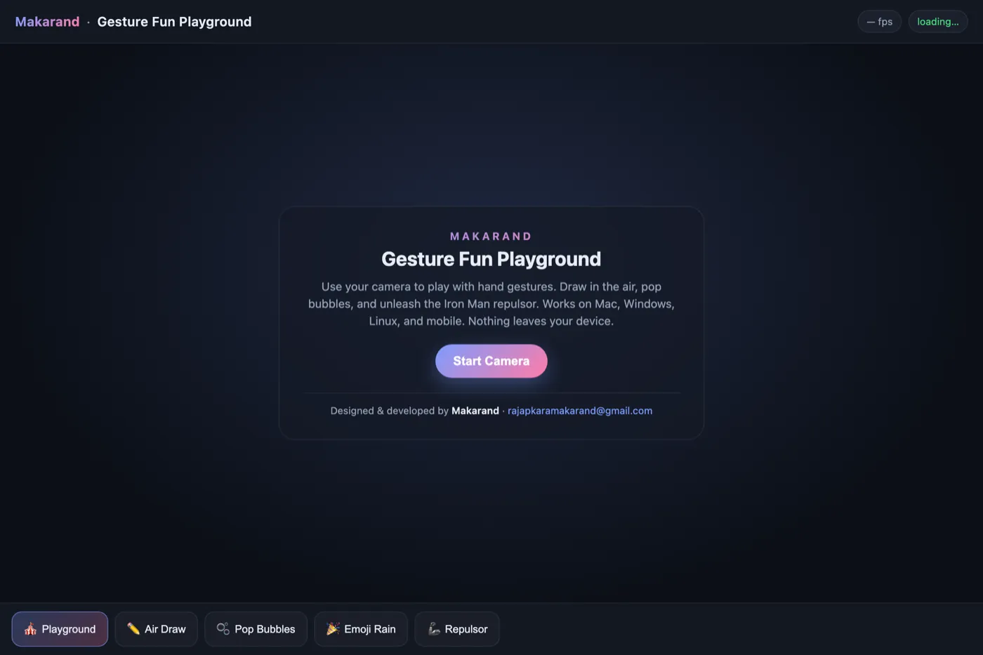
MY ROUTE SO FAR
Seven islands, one course. Pick an island and the ship sails there.
1 / 7
Real problems. Shipped products.
The same path on every project in this portfolio.
If the test fails, it goes round again before anything ships.
Each one tests a single idea about how people interact.
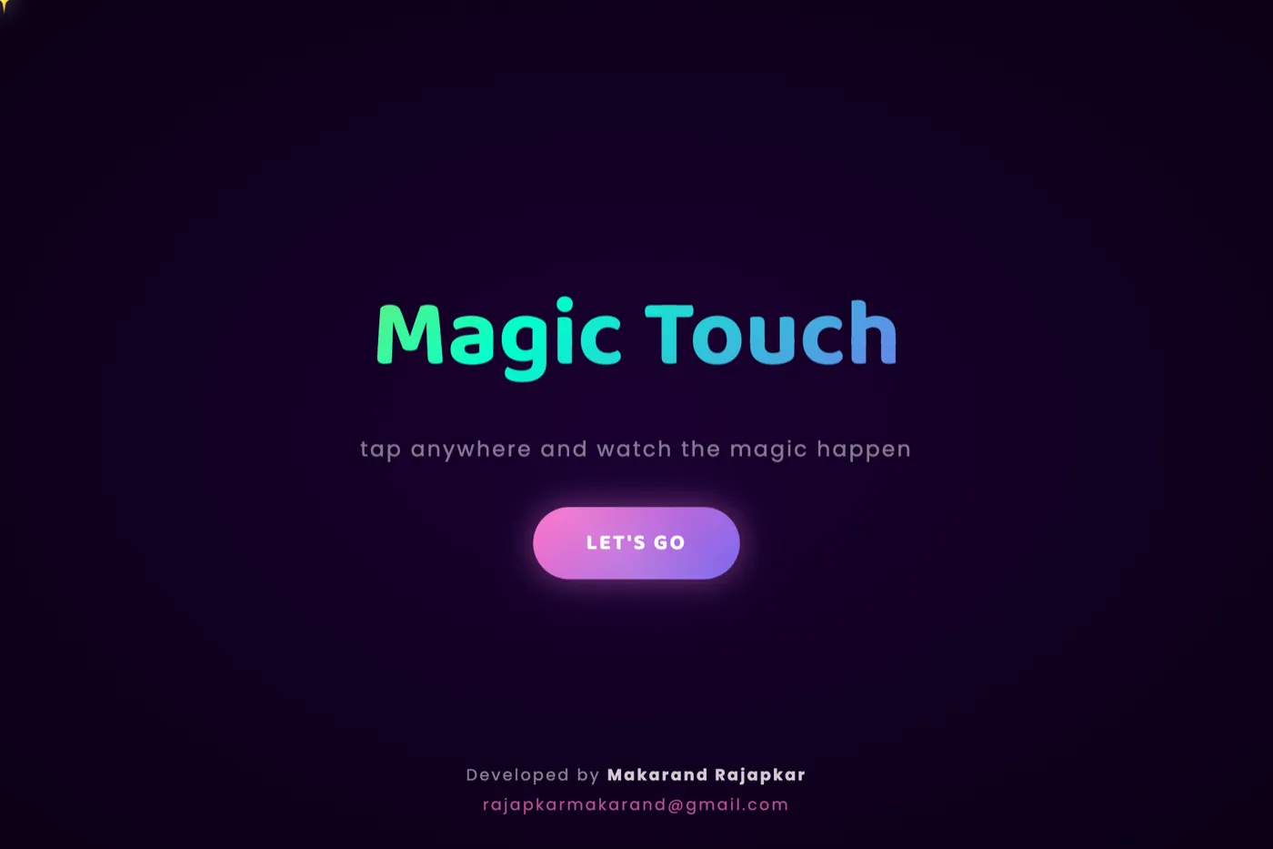
Built for my team at work. Tap one to see the story.
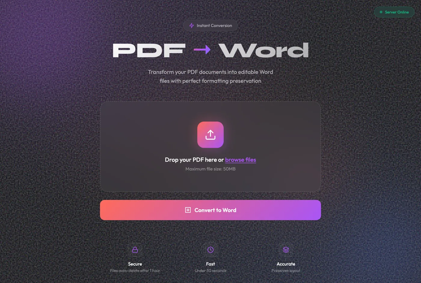
An internal tool for MarketsMojo's compliance team. It turns a PDF into an editable Word file on the office computer, so private documents never go to the internet.
The team was uploading private documents to free websites, just to edit them.
A converter that runs on the office computer. Double-click to start. Files never leave the building.
In use. The key decision wasn't the screen. It was making it start with a double-click.
Compliance often needs to edit PDFs. The only options were free conversion websites. That meant regulated documents went to an unknown company on the internet. The real problem wasn't converting the file. It was where the file went.
The users are compliance officers, not developers. A tool that needs a typed command would never be used twice. So the most important design choice wasn't on the screen at all: it was a launcher you start with a double-click.
Python · FlaskRuns on the computer onlyDrag and dropAuto-deleteOne-click start
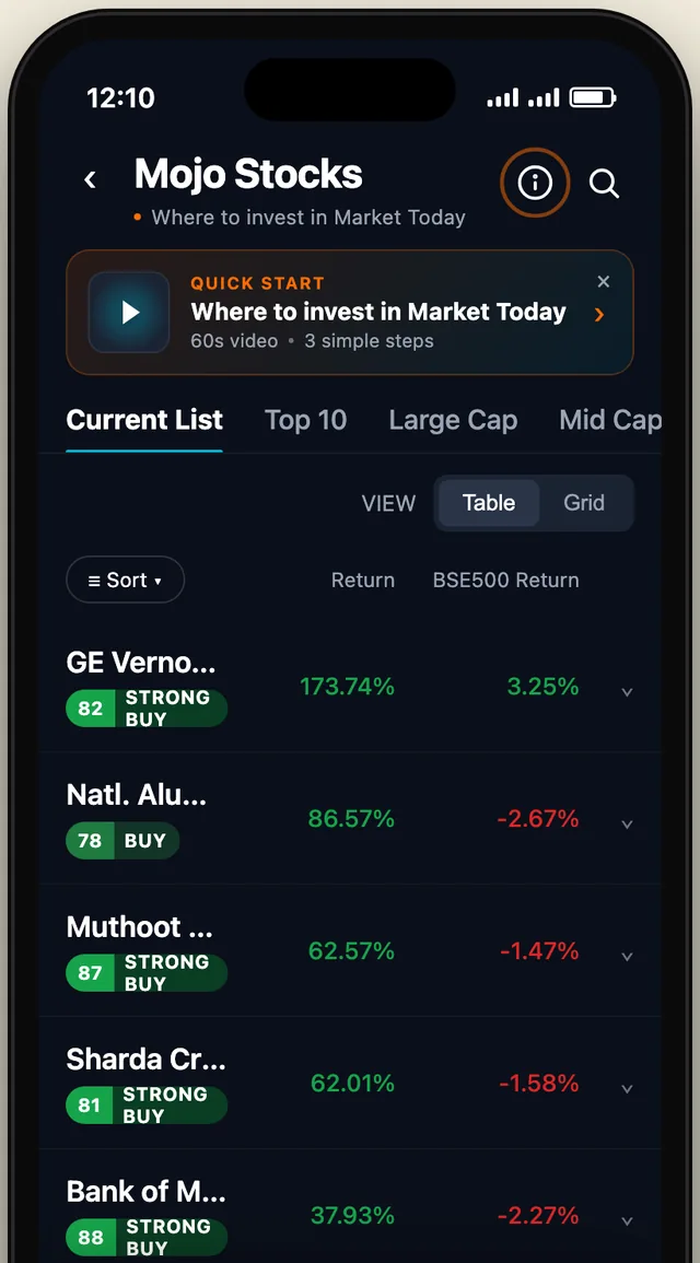
A quick-help entry for the Mojo Stocks list in the MarketsMojo app: a 60-second video and three steps, placed so new users find it and regular users aren't bothered.
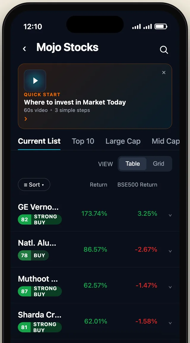

New users needed help. Regular users didn't want to see it.
Three working options, so the team could compare them instead of arguing.
Option A shipped: a small strip you can close, and an info icon that stays.
New users couldn't tell what the stock list was for. The team wanted help to be prominent. But it also had to stay out of the way for people who already know the app. Those two asks pull in opposite directions, so I built all three answers instead of arguing about them.
A one-line quick-start strip above the list that you can close, plus an info icon in the header that stays. It costs two rows of the list, once.
A full card with a video above the list. It pushes the list down the screen, and in a stock app the list is the product.
A full-screen takeover on first open. Sure to be seen, and sure to be skipped. It blocks the app before it has earned any attention.
It was the only option that split the two jobs. The strip is prominent once and can be closed. The info icon keeps help reachable for ever, without taking space from the list again. B and C made help prominent by taking something from the user: screen space or their first ten seconds.
HTML prototype3 working optionsiPhone frameLive in the app
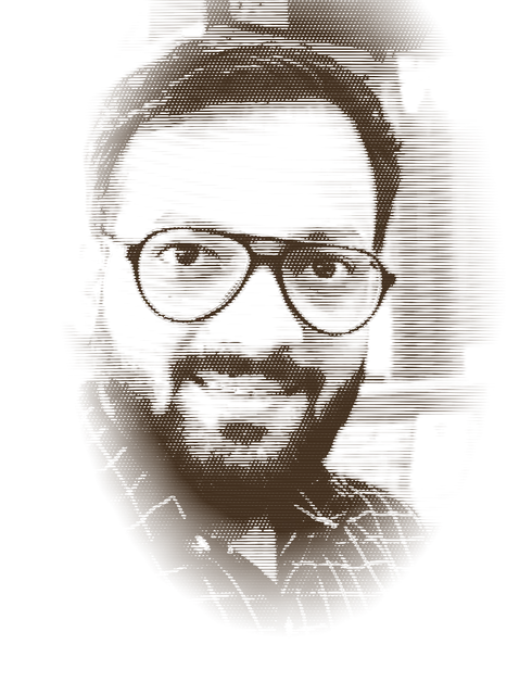
Product Designer · Home port: Mumbai
Twelve years of living inside real problems, in finance, operations, business and everyday life, taught me where people get stuck. Now I chart the course of a product, decide what's worth building and sail it all the way to launch.
Seven islands, one course. Pick an island and the ship sails there.

What I carry onto every voyage.
 SEND WORD
A bottle washed up on the shore. Uncork it: my message is inside.
I'm most useful early, before anyone has decided what to make. If you have a problem worth solving, send word.
rajapkarmakarand@gmail.com Makarand