Too many plans. One simple choice.
Four markets. Four plan lengths. Sixteen different prices on one page. People could not tell which plan was right for them.
Ask one thing at a time. Pick the market first. Then pick how long. The page stops being a wall of sixteen prices.
Four markets. Four lengths. Sixteen prices.
Markets Mojo sells research for different markets. Each one can be bought for six months, one year, two years or three years. All of it had to fit on one page.
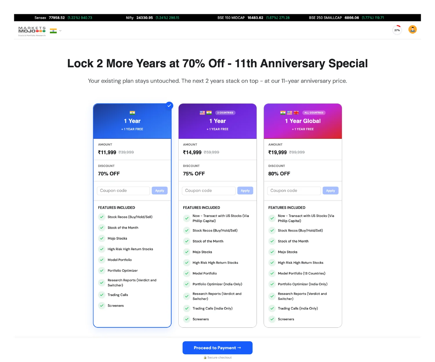
So the job was not only to tidy up. The new page had to carry four lengths instead of one, and four markets instead of three, and still be easier to use than the page it replaced.
Two things to decide at once
Which markets do I want? And for how long? Change one and every price changes with it.
Prices you cannot compare
₹6,375 for six months. ₹19,999 for three years. The smaller number is not the better deal, but it looks like one.
Two kinds of buyer
Most people want to be told which plan to pick. A few want to see everything first. One page has to work for both.
There is a fourth problem, and a clearer page will not fix it: people leave. The moment someone reaches for the back button is the last chance to make them an offer.
Ask one thing, then the other.
Sixteen prices become four choices, and then four more. The market is a row of tabs. The length is a plain list under it.
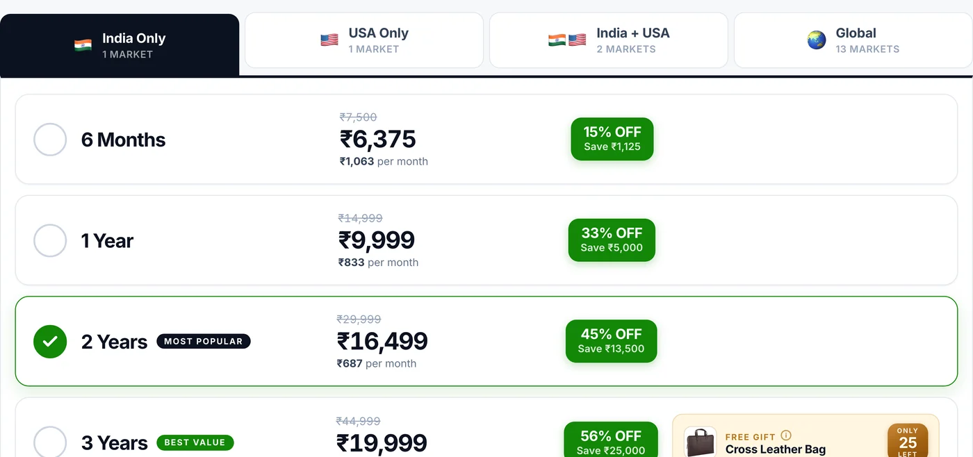
Every price also shown per month
₹16,499 for two years is ₹687 a month. That is the only number that lets you compare four different lengths, so it sits under every price.
One plan marked as the pick
Most Popular on two years. Best Value on three. If you do not want to work it out, the page tells you where to look.
Three tries before this one.
The rows did not arrive first. Two earlier versions asked the wrong question, and a later one proved the layout could live without the sale.
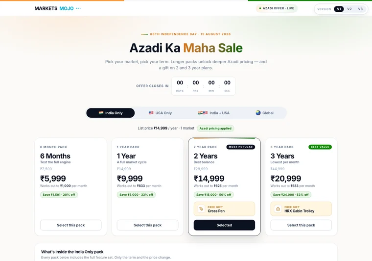
Four cards, all shouting
Side by side, the four lengths competed for attention instead of being read in order. A countdown clock sat on top, adding pressure but no help.
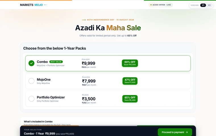
The wrong question
This one sorted plans by which product you get, for one length only. But buyers were not asking which product. They were asking which market, and for how long.
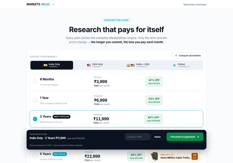
It works all year
The same tabs and rows with the sale styling taken off and a five-year plan added. This is the version that went on to ship.
The countdown is worth a mention. It was tried, then dropped, for the same reason the exit offer has no timer: a clock that restarts every time you reload is not a deadline.
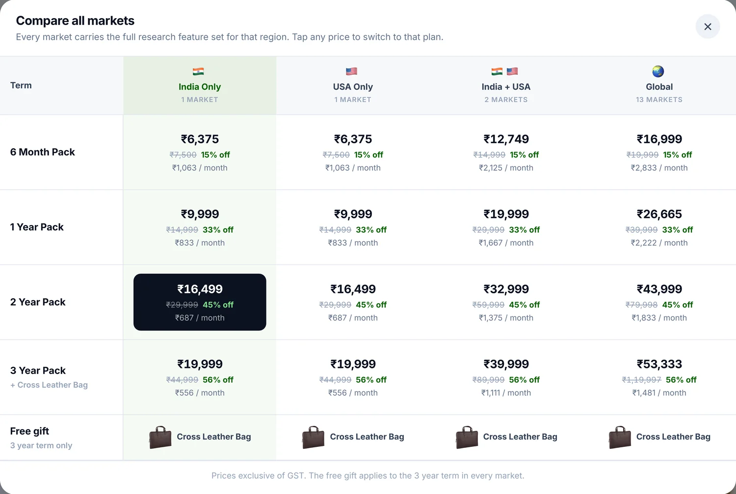
The table was never removed. It was taken off the main path — one tap away for people who want it, out of the way for people who do not.
Then catch people on the way out.
The page watches for four ways of leaving. Each one brings up the same sheet: a discount, a code and a deadline.
Back button
The browser back button, or Alt and the left arrow.
Mouse to the top
The pointer heads up towards the tabs, the menu or the address bar.
Keyboard
Backspace used as back, or an attempt to close the tab.
Coming back
They switched to another tab and returned, so they are still deciding.
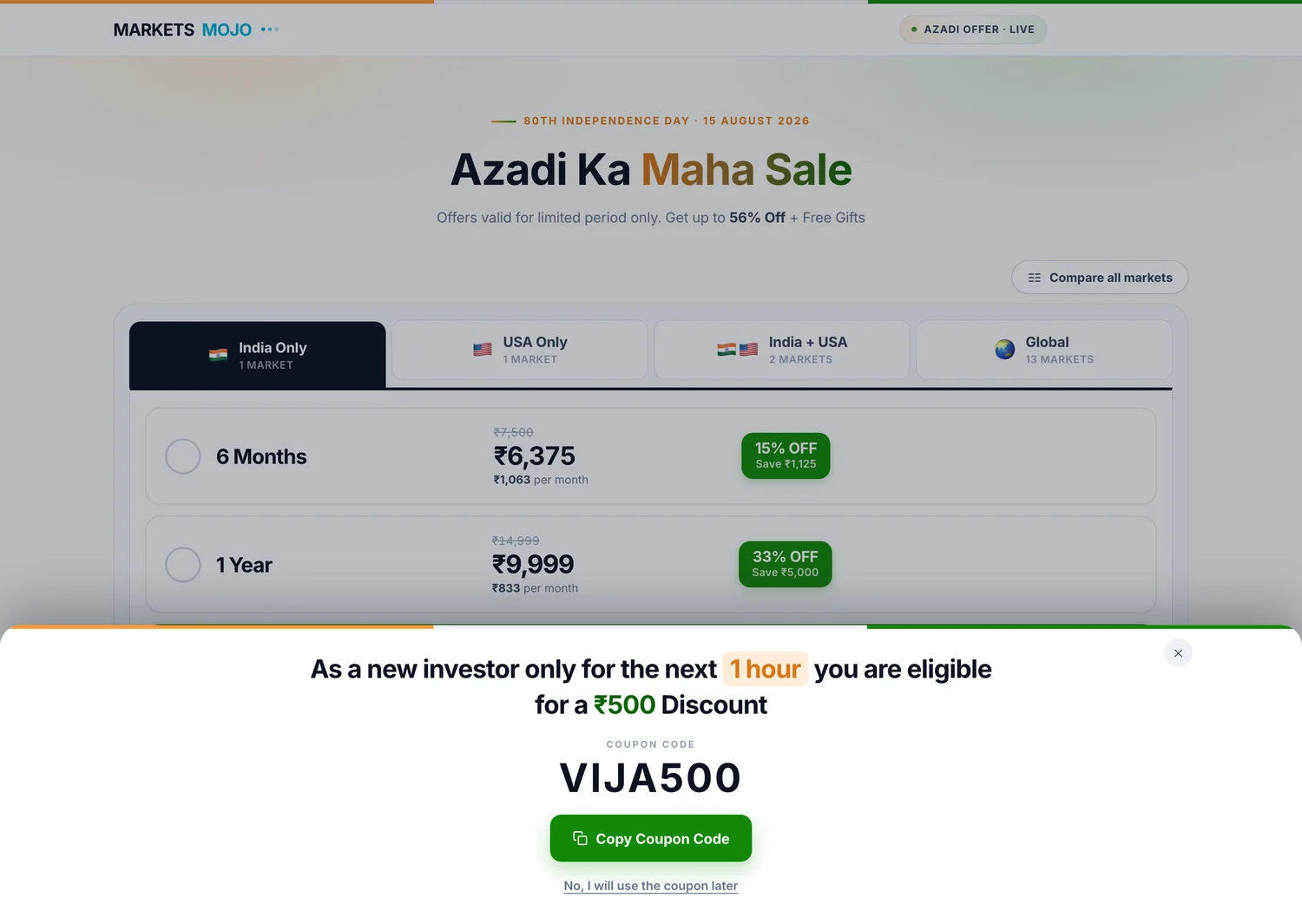
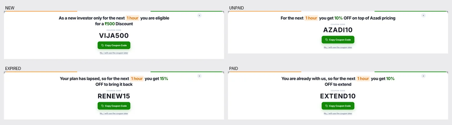
No live timer. A clock that restarts on every reload reads as theatre.
Why the deadline is written out in words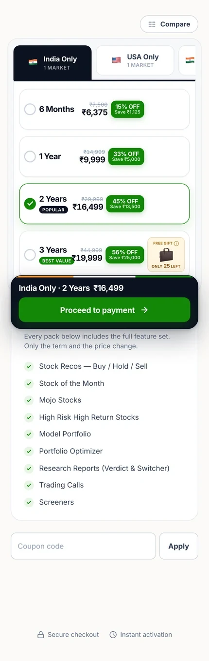
The market, the length and the price sit in a bar that does not move, so the thing being bought is on screen while you read about it.
Not at checkout. If a code is half remembered, people go back to their email, and most of them do not come back.
Every length buys the same research. Only the price and the time change, so the features are listed once instead of four times.
A leather bag on the three-year plan, with the stock left shown next to it. One reward, in one place, instead of a badge on everything.
It shipped, and it is still running.
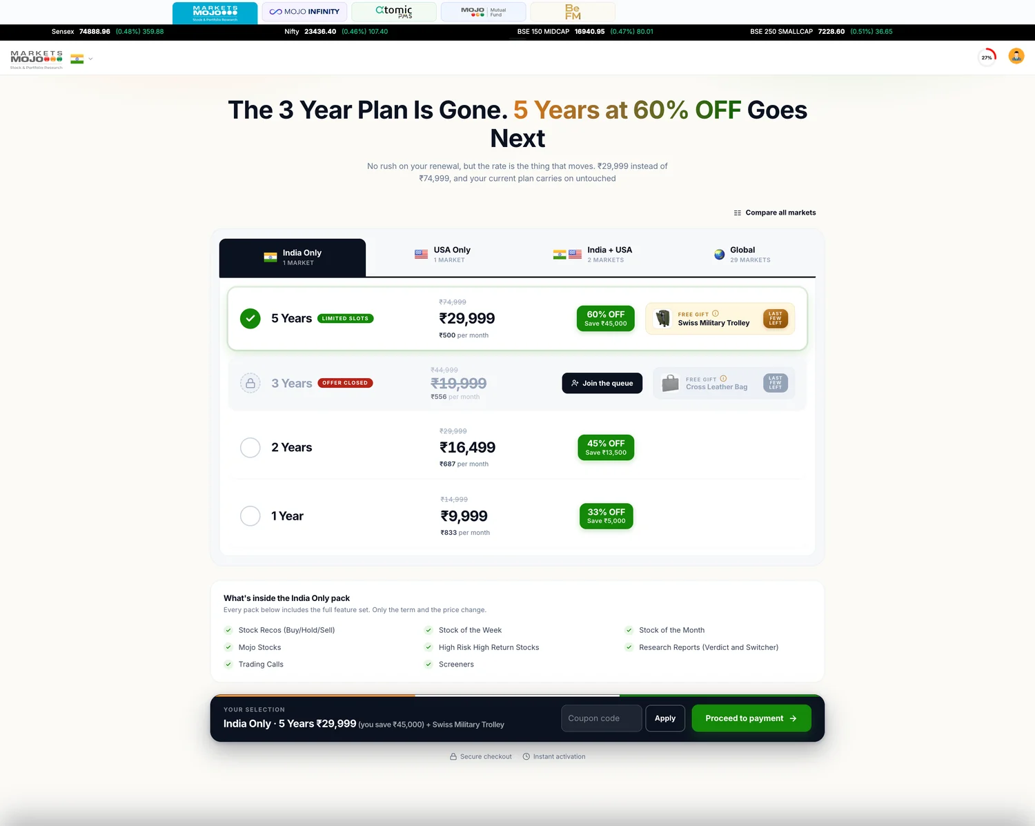
The page is live. The tabs, the plan rows, the per-month prices, the shared feature list, the compare button and the sticky bar all made it through.
Longest first
The rows were flipped so the five-year plan leads. The best per-month price is the first thing you read.
A plan can sell out
The three-year plan now shows as closed, with its price struck through and a Join the queue button in place of Buy.
Global grew
Thirteen markets became twenty-nine. The tab absorbed it without the page changing shape.
The sale is gone
No festival styling anywhere. The structure carried on without the campaign that paid for it.
That last one is the real result. A page built for one sale outlived the sale and became how the product is sold.
Two ways out, built to be measured.
The exit offer was built twice, so the team could measure which version works instead of arguing about it.
V1 — Sheet from the bottom
The sheet slides up on any of the four ways out. Hard to miss, and the version shown here.
V2 — Strip that stays
The same offer as a strip along the page, with the sheet switched off. Quieter, always there, never in the way.
It was handed over as a working page, not a document. Every price and discount is worked out from one list of four markets, so changing a rate changes it everywhere. A developer can see how it behaves by using it.
What is settled
The chooser, the compare table, the four ways out and the four groups. All built and working.
What was still open at handover
The words in the exit offer were placeholders for marketing to sign off, and the discounts and codes in it were examples rather than agreed rates.
A call I made
The brief named two ways out and said "all four" without listing the rest. The keyboard and tab-return ones are my reading, written so either can be switched off in one line.