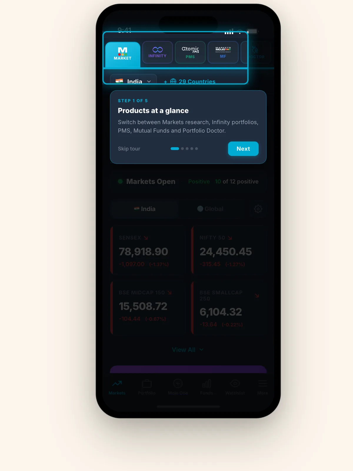
Five products. One confused user.
A company sells five separate products. A customer might own one, three or none — and every combination lands on the same home screen.
The question being asked internally was “how do we show five products on a phone”. Sitting on the business side, I thought the real question was different: what does someone who owns two of them think they bought? Nobody could answer it, because there was nothing to look at.
Design the states, not the screen
One shell, switchable live between three customer states — all products active, one product missing, and a brand-new visitor — with the promo layer and the guided tour toggleable on top.
A dual-accent system, not one brand colour
Two accents that carry meaning — one for the product family you are in, one for actions — so five differently branded products can share a shell without the interface changing personality on every tab.
Fill only what you can tap
A rule for the whole system: a card gets a filled background only if it is interactive. Display-only information gets a border and nothing else.