Making an expert tool usable — without making it weaker.
A strategy builder for everyday investors — people with no finance degree and no technical skill. No queries to write. Testing built in, so a strategy could be tried before any money was risked. And it had to feel premium.
Sold before it was built. The prototype earned revenue in its first hour and funded development. mojofundmanager.com ↗
What I did on this project
The 30-second versionWorking prototype
34 screens that run. Shown live to real users.
Design system + Figma
Tokens, type scale, component states. WCAG 2.1 AA.
Developer handoff
Specs, component map, changelog, prototype.
A brief, not a blank canvas.
The team arrived with a query-driven builder.
“The success of this product depends on how simply you can present these queries and filters.”
Kick-off — promoter & product teamWhat I heard underneath it
Two constraints, pulling against each other:
Anyone can use it. Not just people who write conditions.
Nothing gets weaker. Removing power is the useless answer.
What today's tools ask of a person
Strong engines. Interfaces built for people who think in syntax.
| Tool type | How you express intent | Learnable in one sitting | Tells you if it works | Recovers from a wrong answer |
|---|---|---|---|---|
| Stock screeners | Typed query syntax | No | No — today only | Rewrite the query |
| Broker watchlists | Manual picking | Yes | No | Easy |
| Advisory / tips | Someone else decides | Yes | No | No control |
| Spreadsheets | Formulas + manual data | No | Only if you build it | Fragile |
| What we needed | Guided choices | Yes | Yes — 10 years | Change one rule, re-run |
Heuristic teardown of the starting point
The inherited approach, against basic usability principles.
You must remember the exact field names and the syntax. Nothing on screen helps you.
You learn nothing until you press Run.
A typo returns an empty result. Failure looks like an answer.
A beginner has no first move.
I reframed the brief first.
Wrong problem. Simpler syntax still leaves 65 conditions and no idea which are yours.
“Make the query language simpler.”
Autocomplete and tooltips. You still need the system's words.
“How might we let someone express an investment intent they already hold, in their own terms, and see whether it holds up?”
Shifts the unit of work from a condition to an intention.
Who I was designing for
The opinionated investor
A clear view. No way to act on it.Blocked at the first screen.
The cautious first-timer
Needs evidence before committing money.Needs the rehearsal.
The power user
Will leave if simplifying costs them control.Constraint B exists for them.
The flow I proposed
The journey, before any screen. The fork after Preview is what I argued for.
Five directions, sketched.
All five went to the team, not one answer. Four failed the same way.
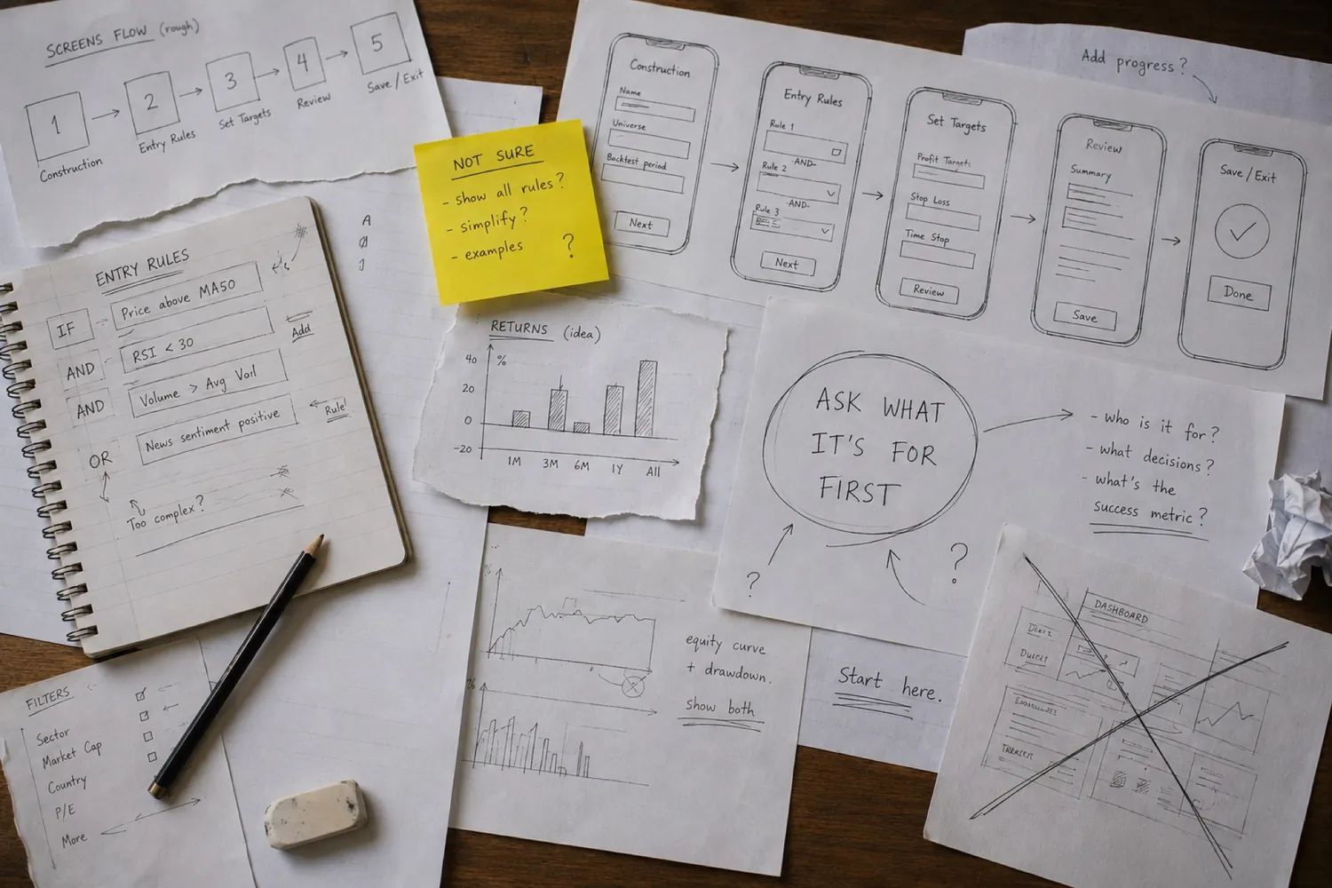
A · Assisted query
Help on the box that exists.
How long will you stay invested?
B · Question wizard
Twenty questions, one per screen.
C · Template first
Pick a ready strategy, then adjust it.
D · Node canvas
Drag conditions onto a canvas.
What is this portfolio for?
E · Context, then choices
Ask what it's for. Shape the rest around the answer.
Why E won — the same screen, two orders
↳ “Which of these are mine?”
What is this portfolio for?
↳ Fewer options, all relevant. The rest one tap away.
Low fidelity, so it could be argued with.
Structure first. Styling later.
Construction
Its answers shape everything after.
Entry
Rule rows, connectors, a live count, reorder handles. Every other screen is a variation of this.
Exit
Same components as Entry. Starts filled, because people skipped it.
Manage
Priority and frequency. Order is a real decision, so it drags.
Preview
The strategy in plain words, then the fork. Backtest sits level with Take live.
The component everything depends on
Readable as a sentence. Quick to operate.
The plain name, not the database field.
Words, not symbols.
Validated as you type. An impossible rule can't be saved.
Order changes meaning, so it drags.
Joining rules without teaching Boolean logic
People say “and” and “or” without thinking about precedence. So it's drawn, not explained.
One setting for every rule. No way to say “these two together — or that one alone.”
ANDs group into one bracket; an OR starts a new one.
The structure came from watching people fail.
One task, given to real people:build a strategy you'd actually be willing to fund.Where they hesitated changed the design.
People scrolled, lost their place, and couldn't tell how far along they were.Split into five named steps with visible progress, and blocked forward jumps until the current step was valid.
People froze at the full list.Moved context ahead of choice, and used those answers to shorten and order the list.
Entry was careful. Exits were guessed.
People stalled at the end, becausenothing had told them it was right.
The Entry step, three rounds
Real screens, in the order they were made.
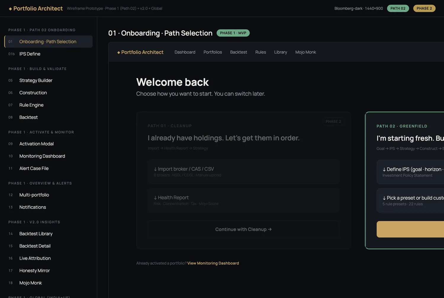
Every screen mapped and navigable.Structurally complete, and nobody could start.One dense screen, no way in.
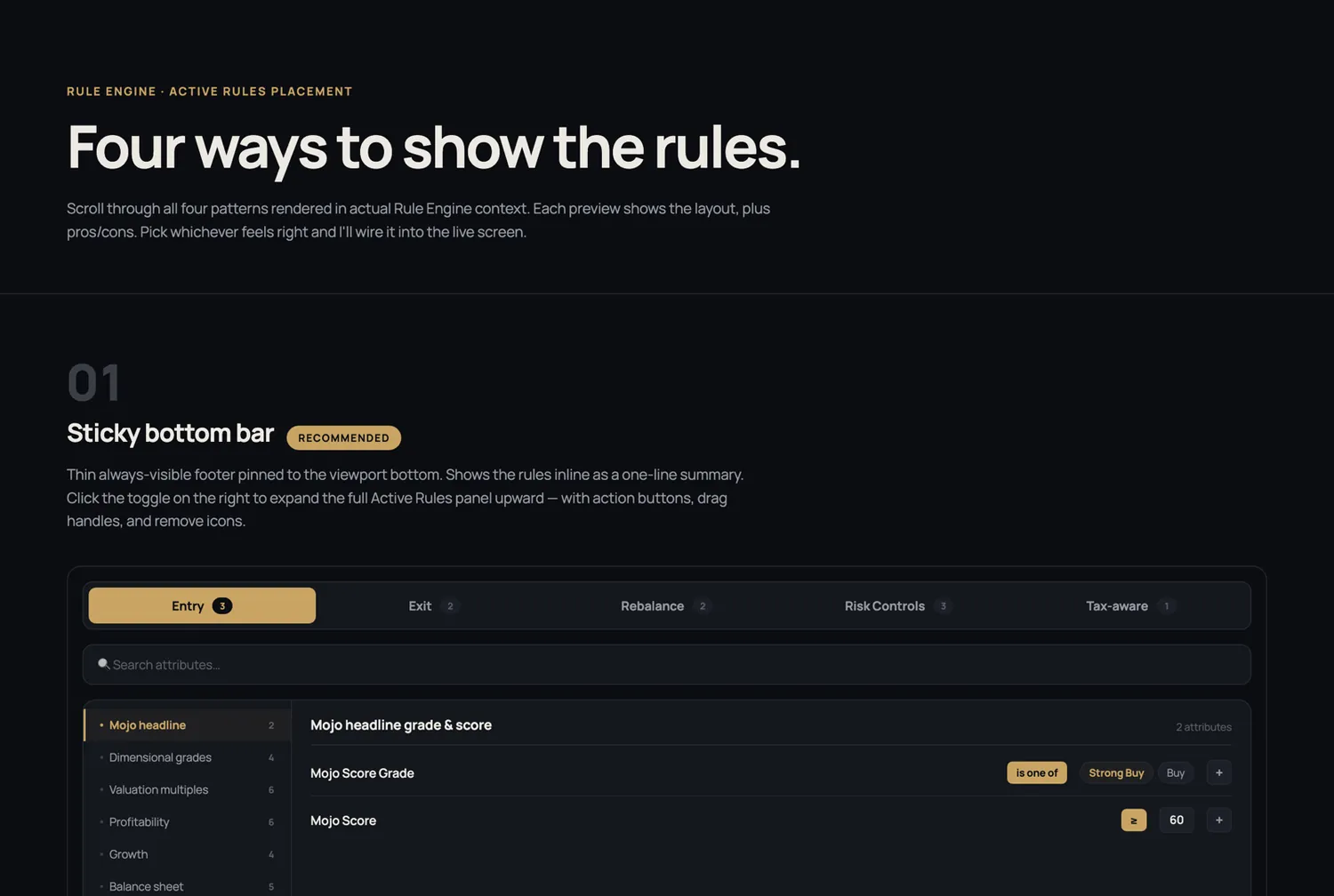
Four layouts for one screen, each built in real context.Placement improved; the first move didn't.
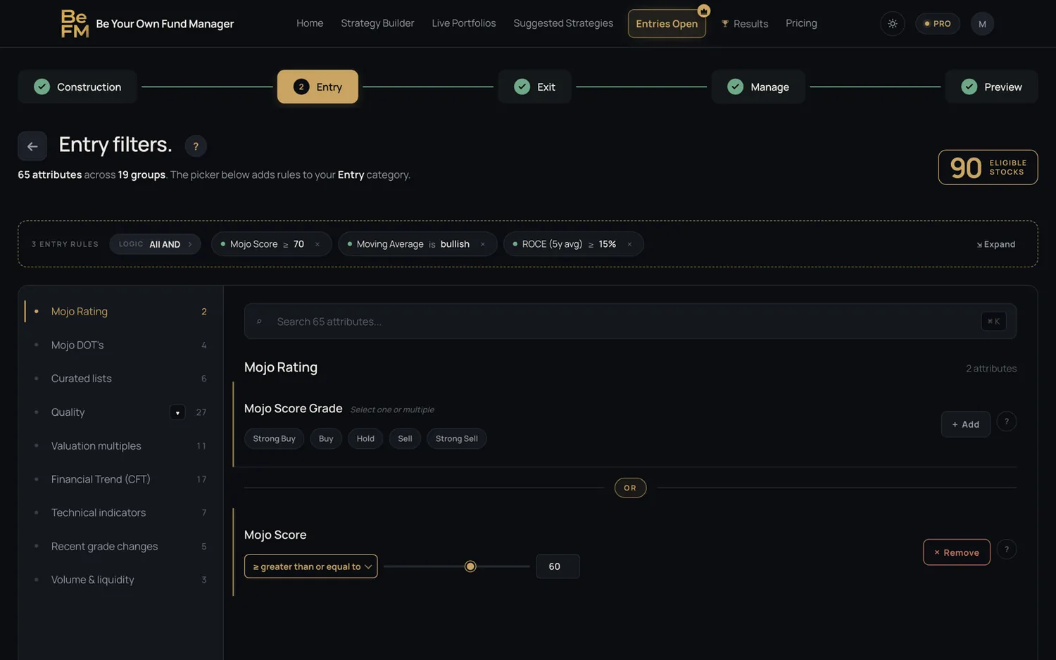
Step tracker, rules as removable chips, categories aside, and alive count of 94 eligible stocksthat moves as you edit.
One system, 34 screens, no drift.
Closer to a private bank than a trading terminal. This is someone's savings.
Type — one family, nine sizes
One family. A fixed scale, so no screen invents its own.
One accent, and a rule about numbers
One gold accent per view. Gain and loss on numbers only.
Spacing — a 4px base
Every gap is a multiple of four.
Accessibility — WCAG 2.1 AA, verified
Calculated, not eyeballed. The light theme inherits every ratio.
Colour is never the only signal.
Mobile was not an afterthought.
The same product, rebuilt for a phone — not shrunk onto one.
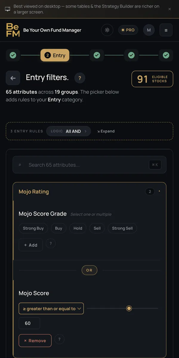
I built the thing I designed.
I built it as a working prototype. AI wrote the code, I made every decision.
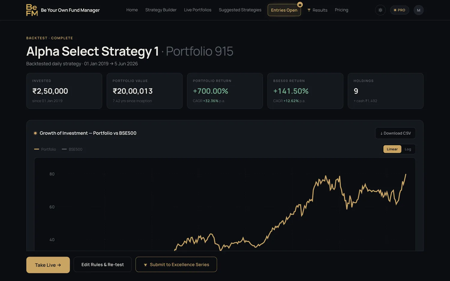
Real state, real interaction. Every flow runs.This is what was demonstrated in the webinar.
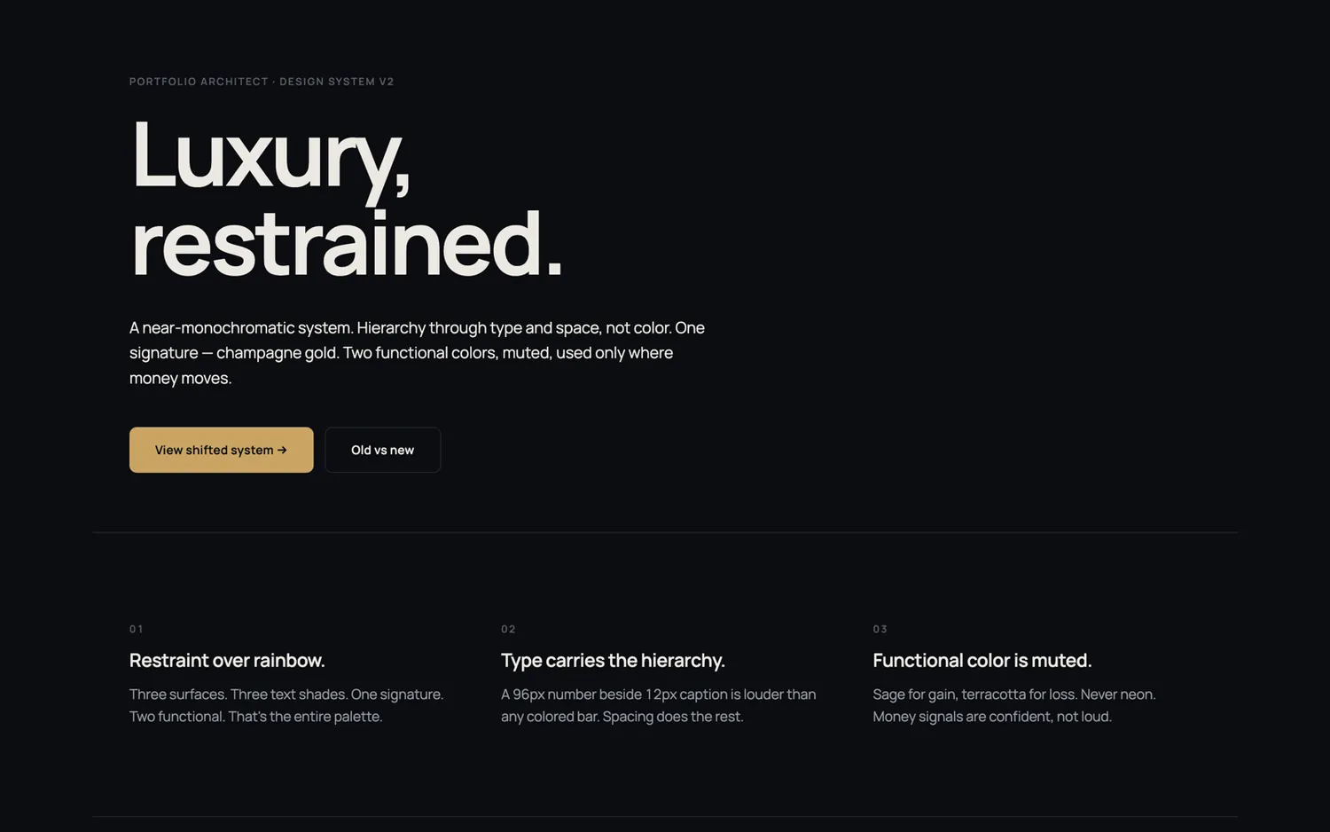
Palette, type, states, spacing — written down so 34 screens couldn't drift.
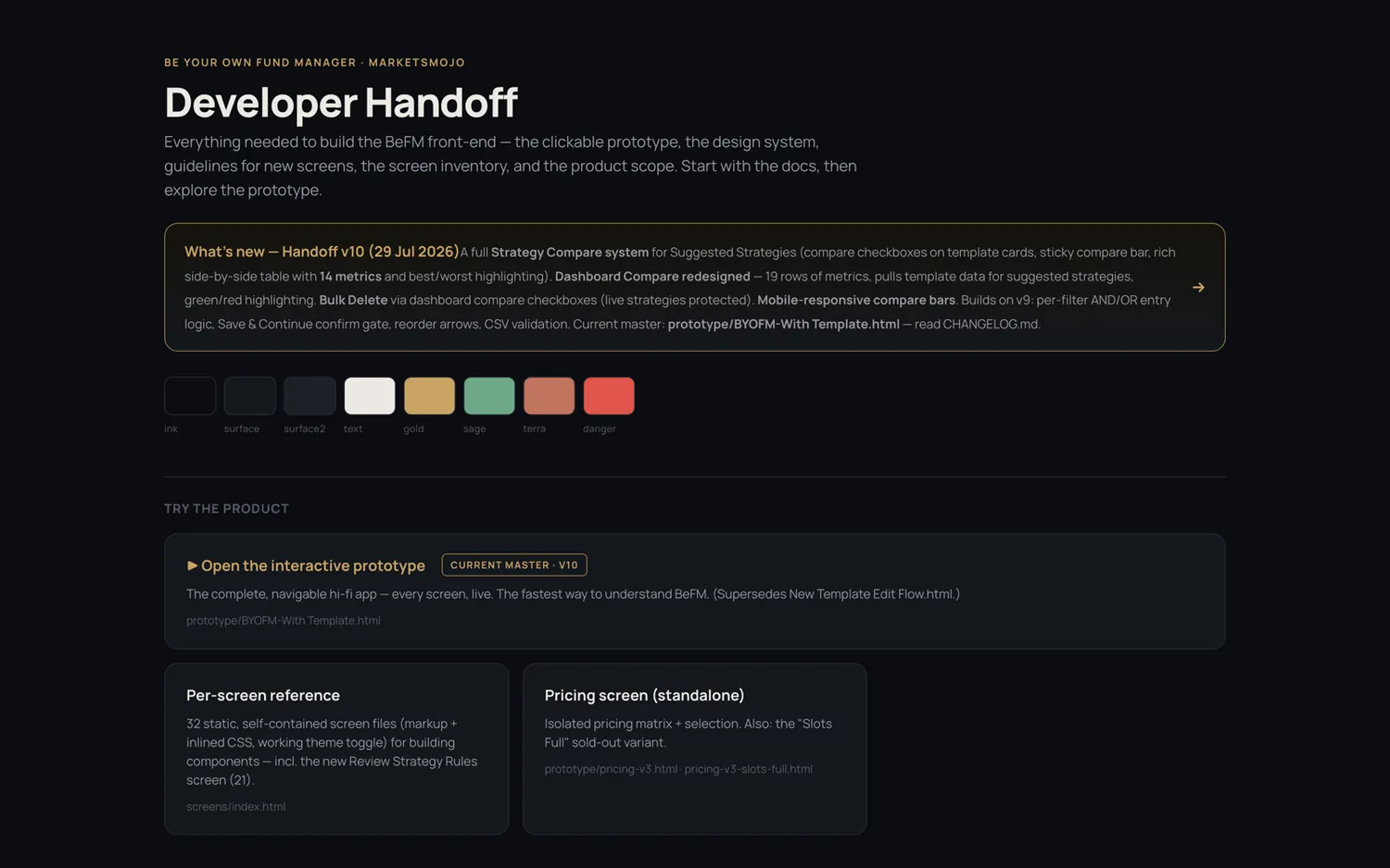
A package, not a link: design-tokens.css, six docs, 32 self-contained per-screen reference files, a versioned changelog, and the prototype as the source of truth.
What handoff looked like
Written as behaviour, not pixels. The prototype showed the look.
spacing: 12px / 8px gap · radius 8
operator: gold · only editable logic in view
states: default · hover · selected · error · locked
reorder: drag handle + keyboard arrows
logic: connector per rule · AND binds tighter
a11y: 4.5:1 minimum · not colour-alone
Validation, before engineering started
Demonstrated live to real users, running end to end.It generated revenue within the first hour, and funded the build before a line of production code was written.
Flows were refined from that feedback. Then it was built.
Commercial figures available on request
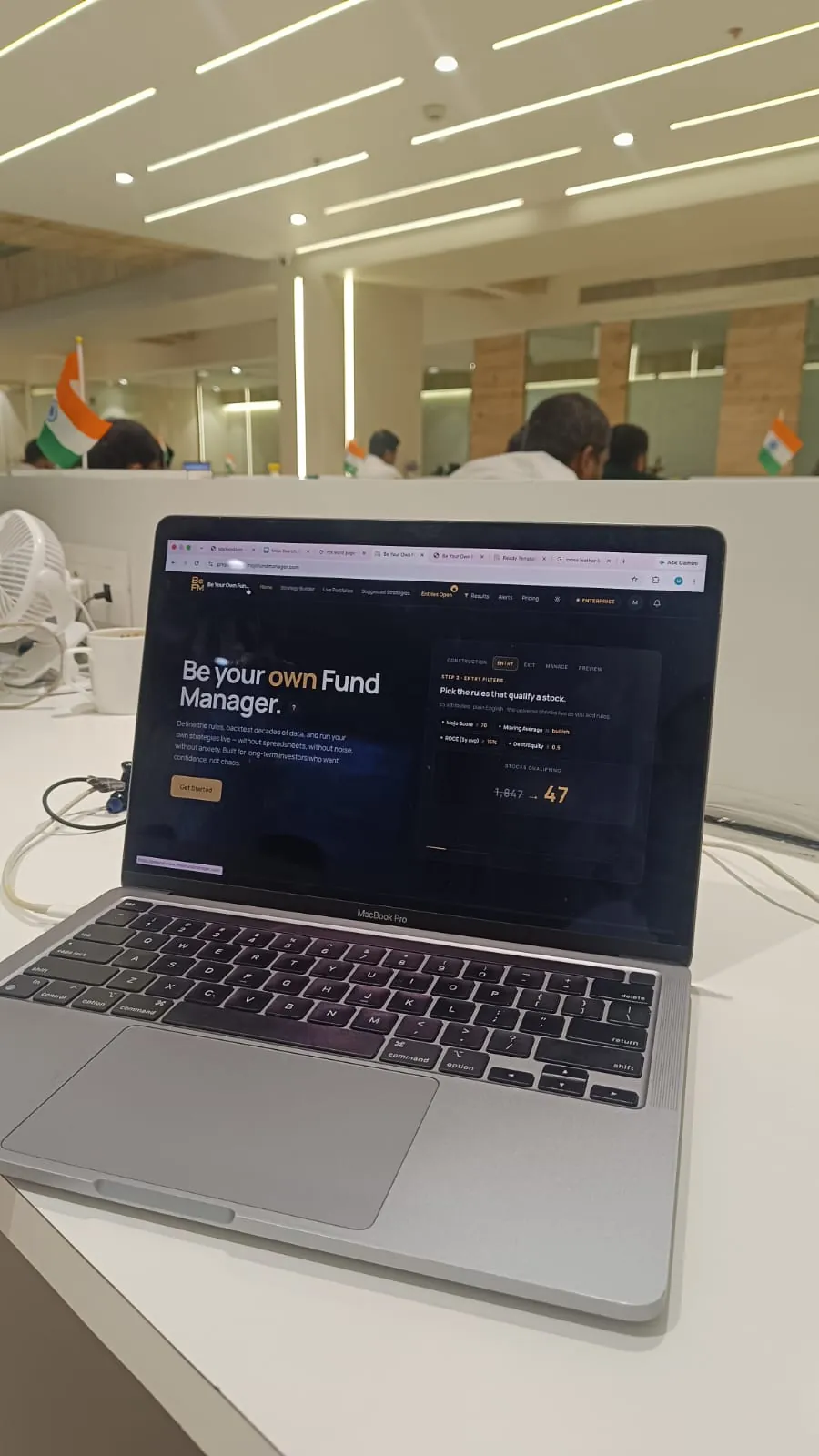
The prototype — running here
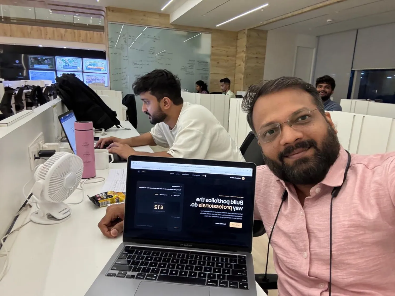
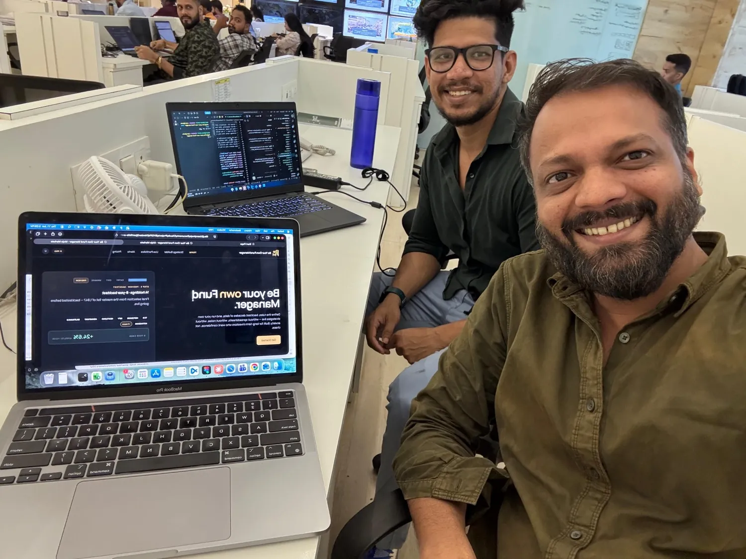
Designed and built at the desk, with the team.
Reviewing the builder, watching a backtest run, and the day it went live.
What I'd carry into the next one.
Reframing the brief was the work
I was asked to simplify a query language. The value was arguing the unit of work is an intention, not a condition.
Tidier ≠ solved
Neat, and it barely moved the outcome. Visual order can hide an unsolved problem.
Building it changed the design
Empty states, validation, the way back from a backtest. Building it forced the answers.